---
title: "Summer 2026 Wildfires in Europe: State of the Season"
subtitle: "EFFIS rapid perimeters, as of 2 September 2026"
author: "Pierre Beaucoral"
date: 2026-09-03
execute:
freeze: false
---
Every summer now brings the same headlines out of the Mediterranean, and the
same question underneath them: is this year actually worse, or does it just
feel that way? The 2026 fire season is about thirteen weeks old, and this page is
my attempt at an answer: what has burned so far, where, and how that compares
with recent seasons at the same point in the calendar. It is a **state of the
season**, not a verdict.
A word on the data first. Satellites spot large fires, and Europe's EFFIS
service (part of the Copernicus programme) draws the outline of each burned
area it can map. I work with those outlines. I measure each fire's size
directly from its shape, using a map projection that keeps areas honest, so
hectares are comparable across countries. And I count only the parts that
fall inside Europe. The method is the same as in the [2025 season
analysis](2025.qmd) this project grew out of; that
post remains the reference for the details.
::: {.callout-note title="Three things to know about these fire outlines"}
- **Most mapped fires are small, not big.** EFFIS once caught mainly fires of
roughly 30 hectares and up, but sharper Sentinel-2 imagery now maps far
smaller ones too, so most outlines on this page are in fact well under 30
hectares. The very smallest fires are still missed, so totals stay below
official statistics.
- **The outlines are rapid estimates.** They are revised as better satellite
imagery arrives. Every number on this page will move a little with each
weekly update, and that is by design.
- **I compare burned area, not fire counts.** The detection system changed in
2023 to 2024 and suddenly saw many more small fires. Counting fires across
years is therefore misleading; measuring area is much safer.
:::
```{r}
#| label: setup
# -------------------- Packages --------------------
library(sf)
library(dplyr)
library(tidyr)
library(tibble)
library(purrr)
library(lubridate)
library(forcats)
library(ggplot2)
library(scales)
library(patchwork)
library(janitor)
library(rnaturalearth)
library(leaflet)
library(htmlwidgets)

# GDAL caps single GeoJSON features at ~200 MB; the 2020 snapshot has one
# giant multipolygon above that (documented in scripts/fetch_effis.R).
Sys.setenv(OGR_GEOJSON_MAX_OBJ_SIZE = "0")

# -------------------- Shared helper library --------------------
source(file.path("R", "helpers.R"))   # to_num, parse_date_any, lab_si_ha
source(file.path("R", "geo.R"))       # Europe polygons, read_effis, tagging
source(file.path("R", "cache.R"))     # cached()
source(file.path("R", "theme.R"))     # pal_lc, theme_burns()
source(file.path("R", "flags.R"))     # flag_table()
source(file.path("R", "pipeline.R"))  # season assembly (all cached)
source(file.path("R", "plots.R"))     # plot_envelope() (shared with index)
source(file.path("scripts", "latest_snapshot.R"))

# -------------------- Season parameters --------------------
YEAR_CURRENT <- 2026L
HIST_YEARS   <- 2017:2025   # archive effectively starts 2016; 2016 kept out of
                            # the band (partial-quality first year), see caveats
SEASON_START_MONTH <- 6L    # season window: 1 Jun -
SEASON_END_MONTH   <- 9L    # 30 Sep

# Calendar heatmap DOES include 2016 (the archive's first, partial-quality
# year) -- unlike HIST_YEARS above, since a full-decade grid is the point of
# that chart; 2016's row is captioned as lower-confidence rather than dropped.
CALENDAR_YEARS <- 2016:2025

snap <- latest_snapshot()
stopifnot(!is.na(snap))
eu <- get_eu()

# -------------------- Core objects (all disk-cached) --------------------
envelope <- build_envelope(
  hist_years = HIST_YEARS, year_current = YEAR_CURRENT,
  snapshot_dir = snap, eu = eu,
  start_month = SEASON_START_MONTH, end_month = SEASON_END_MONTH
)

tagged_2026_full <- get_tagged_full_year(YEAR_CURRENT, snap, eu)

as_of     <- envelope$meta$as_of_date
as_of_lab <- paste(day(as_of), month.name[month(as_of)])   # English, locale-proof

# Season-window (Jun 1 - as-of) headline numbers
season_ha    <- envelope$meta$current_cum_ha
season_n     <- envelope$meta$current_n_fires
pct_vs_med   <- envelope$meta$pct_vs_median
median_ha    <- envelope$meta$median_to_date_ha

# Full-2026-to-date numbers (Jan 1 - as-of), used by maps and rankings
full_ha <- sum(tagged_2026_full$area_ha, na.rm = TRUE)
full_n  <- nrow(tagged_2026_full)

# Land-cover machinery shared by several chunks
lc_cols <- c("broadlea", "conifer", "mixed", "scleroph", "transit",
             "agriareas", "artifsurf", "othernatlc", "otherlc")
lc_labels <- c(
  broadlea = "Broad-leaved forest", conifer = "Coniferous forest",
  mixed = "Mixed forest", scleroph = "Sclerophyllous veg.",
  transit = "Transitional woodland-shrub", agriareas = "Agricultural areas",
  artifsurf = "Artificial surfaces", othernatlc = "Other natural LC",
  otherlc = "Other LC"
)

# -------------------- Figure captions (referenced via !expr) --------------------
cap_envelope <- sprintf(
  paste(
    "Cumulative burned area since 1 June: 2026 to date against the 2017–2025 range.",
    "The shaded band spans the minimum and maximum cumulative trajectory of the nine",
    "previous seasons on each day of the season; the dashed line is their median.",
    "The 2026 line stops at its last mapped perimeter (%s)."
  ),
  as_of_lab
)
cap_hero <- sprintf(
  paste(
    "Burn-scar perimeters mapped by EFFIS in 2026 to date (1 January – %s),",
    "Europe-clipped. Perimeter outlines drawn on national borders; rapid Sentinel-2",
    "mapping now captures fires down to a few hectares, with the smallest still",
    "under-represented. Source: EFFIS rapid perimeters,",
    "snapshot %s; geometry in EPSG:3035."
  ),
  as_of_lab, basename(snap)
)
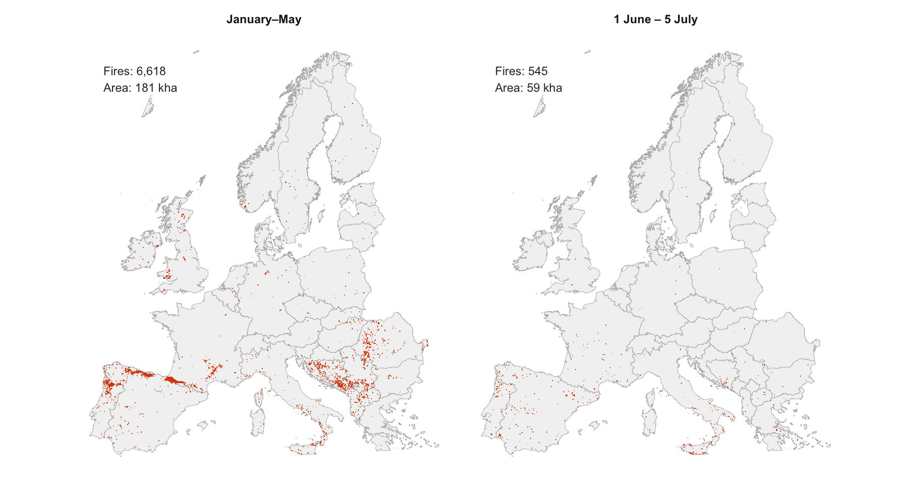
cap_facet <- sprintf(
  paste(
    "The same 2026 perimeters split by period: late winter and spring (January–May)",
    "versus the summer window so far (1 June – %s). Panel labels report mapped",
    "perimeters and Europe-clipped burned area per period. Source: EFFIS rapid",
    "perimeters, snapshot %s."
  ),
  as_of_lab, basename(snap)
)
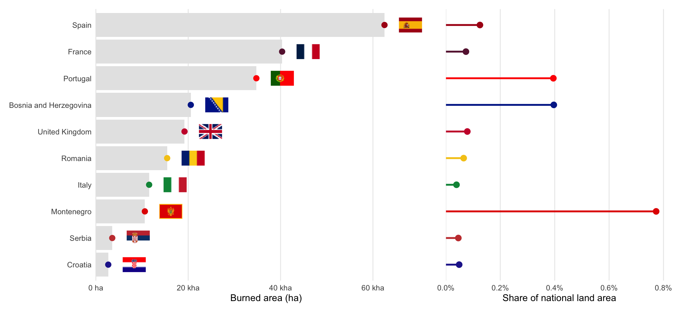
cap_countries <- sprintf(
  paste(
    "Top-10 countries by Europe-clipped burned area, 1 January – %s 2026.",
    "Left: total mapped burned area. Right: the same total as a share of national",
    "land area (land area computed from the same reference polygons,",
    "mainland-Europe crop). Source: EFFIS rapid perimeters, snapshot %s; areas from",
    "geometry in EPSG:3035; countries tagged by maximum overlap."
  ),
  as_of_lab, basename(snap)
)
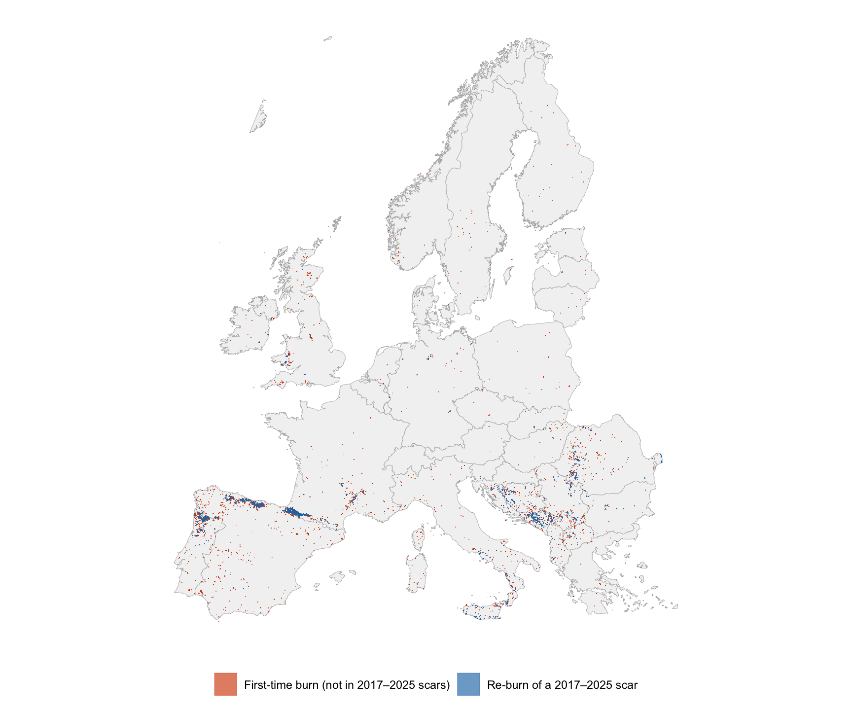
cap_reburn <- sprintf(
  paste(
    "2026 perimeters (1 January – %s) split into first-time burns (orange-red) and",
    "re-burns of ground already inside a 2017–2025 EFFIS perimeter (blue). Overlap",
    "computed on ~100 m-simplified geometry in EPSG:3035. Source: EFFIS rapid",
    "perimeters, snapshot %s."
  ),
  as_of_lab, basename(snap)
)
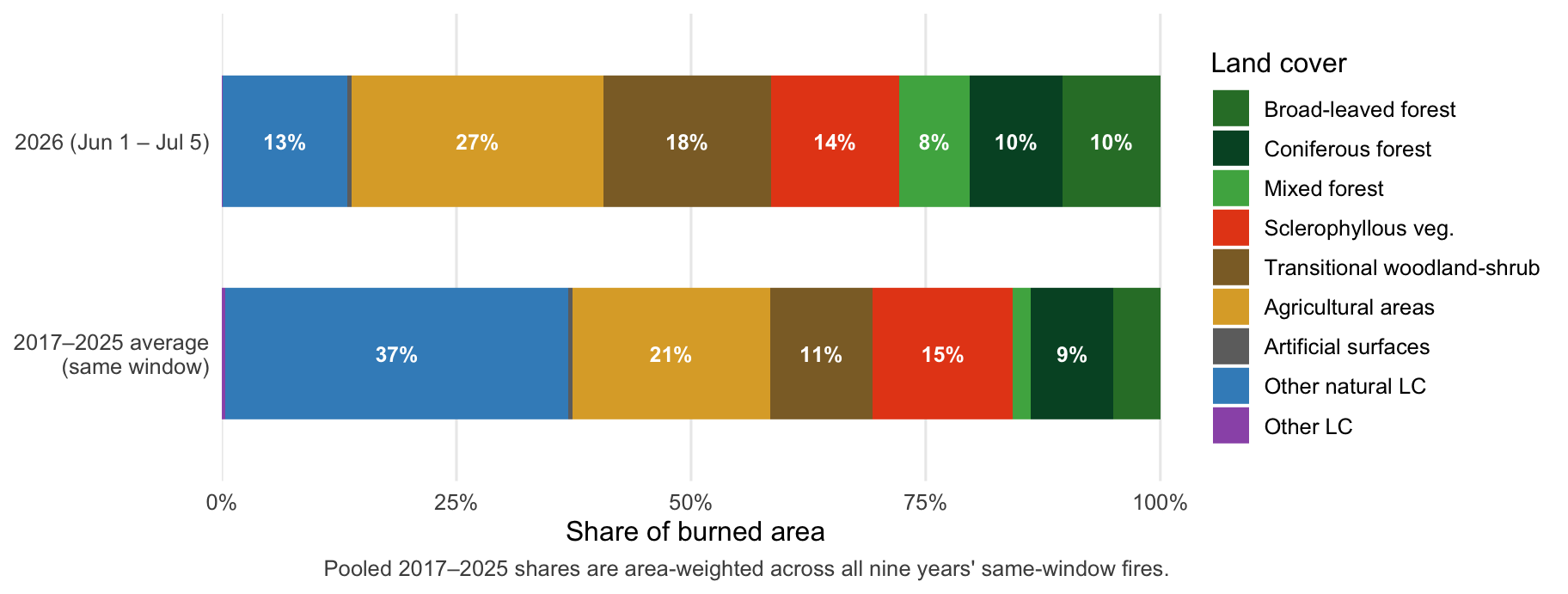
cap_landcover <- sprintf(
  paste(
    "Land-cover composition of burned area in the 1 June – %s window: 2026 versus",
    "the pooled (area-weighted) 2017–2025 average for the same window. Shares are",
    "each perimeter's land-cover percentages weighted by its Europe-clipped area.",
    "Source: EFFIS rapid perimeters, snapshot %s."
  ),
  as_of_lab, basename(snap)
)
cap_calendar <- sprintf(
  paste(
    "Weekly Europe-clipped burned area by year, %d–%d, in ISO calendar weeks.",
    "Fill on a square-root scale: many weeks burn exactly zero hectares, which a",
    "log scale cannot display, and sqrt still compresses the July–August peaks",
    "enough to keep smaller months visible. Grey cells are 2026 weeks that have",
    "not happened yet; the dashed line marks the last mapped week so far (%s).",
    "2016 is the archive's first year and its coverage is less complete than",
    "later years. This chart uses burned area, not fire counts, so the",
    "2023-to-2024 detection-system change (which makes counts incomparable",
    "across years) mostly washes out. Source: EFFIS rapid perimeters,",
    "snapshots covering %d–%d; areas from geometry in EPSG:3035, Europe-clipped."
  ),
  min(CALENDAR_YEARS), YEAR_CURRENT, as_of_lab, min(CALENDAR_YEARS), YEAR_CURRENT
)
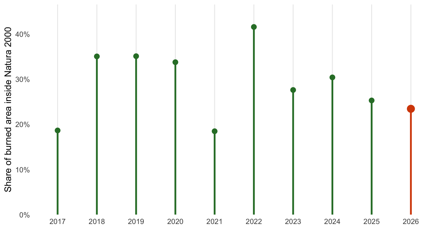
cap_natura_trend <- sprintf(
  paste(
    "Share of Europe-clipped burned area falling inside a Natura 2000 protected",
    "site, 1 June – %s each year, computed as area-weighted PERCNA2K (EFFIS's own",
    "field for the share of each perimeter's own area inside Natura 2000). The",
    "window is identical every year, so the series is not distorted by how much",
    "of the season had elapsed. 2026 is highlighted. Source: EFFIS rapid",
    "perimeters, snapshots covering 2017–%d."
  ),
  as_of_lab, YEAR_CURRENT
)
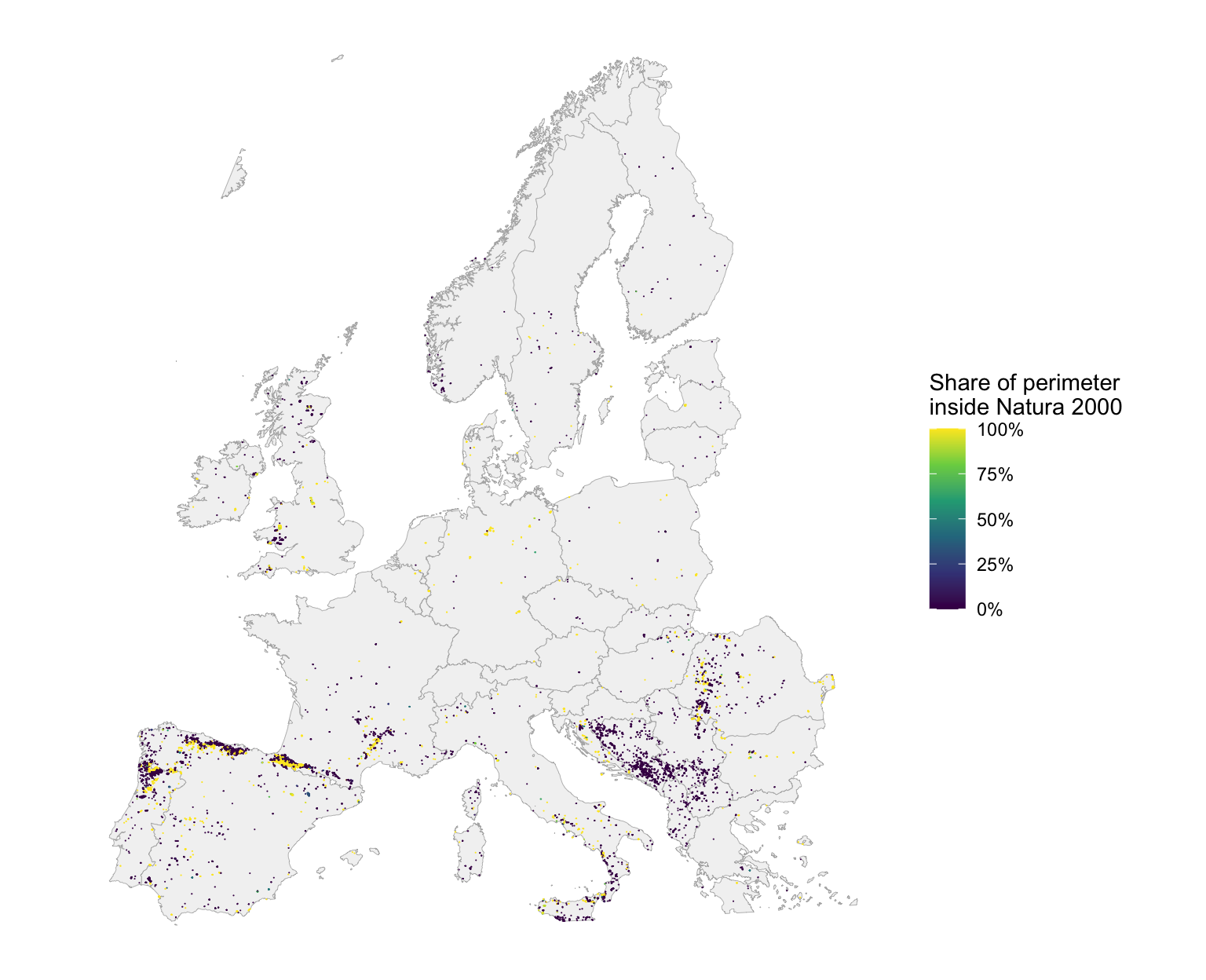
cap_natura_map <- sprintf(
  paste(
    "2026 perimeters (1 January – %s) colored by PERCNA2K, the share of each",
    "fire's own perimeter that falls inside a Natura 2000 protected site. Grey:",
    "0%% (no protected-area overlap). Bright yellow: perimeters that burned",
    "almost entirely inside protected land. Source: EFFIS rapid perimeters,",
    "snapshot %s."
  ),
  as_of_lab, basename(snap)
)
```
Two numbers set the scene, and they cover different time windows. Since
**1 June**, the start of the summer season, satellites have mapped about
**`r comma(round(season_ha, -3))` hectares** of burned land in Europe, across
`r comma(season_n)` separate fire outlines. That is roughly
`r round(season_ha / 10500)` times the area of the city of Paris, and about
**`r if (is.na(pct_vs_med)) "n/a (too early in season)" else sprintf("%.0f%%", pct_vs_med)`** of what a typical recent season had
burned by this date (`r if (is.na(median_ha)) "n/a" else comma(round(median_ha, -3))` hectares). But 2026 did
not start in June. Counting from **1 January**, the total is already about
**`r comma(round(full_ha, -3))` hectares**, and an unusually busy late winter
and spring drove much of that gap, weeks before most people start watching
for fire season at all. That early burst was this year's strangest thread for
months; summer has since arrived in force and has now overtaken it, with the
single worst week of the season landing in late July, and the calendar chart
further down traces both. The chart right below sticks to the
summer window, so that seasons are compared like for like; the maps after
that show everything mapped in 2026 so far.
# Is this season bad so far?
```{r}
#| label: envelope
#| fig-width: 9.5
#| fig-height: 5.5
#| fig-cap: !expr cap_envelope
plot_envelope(envelope)
```
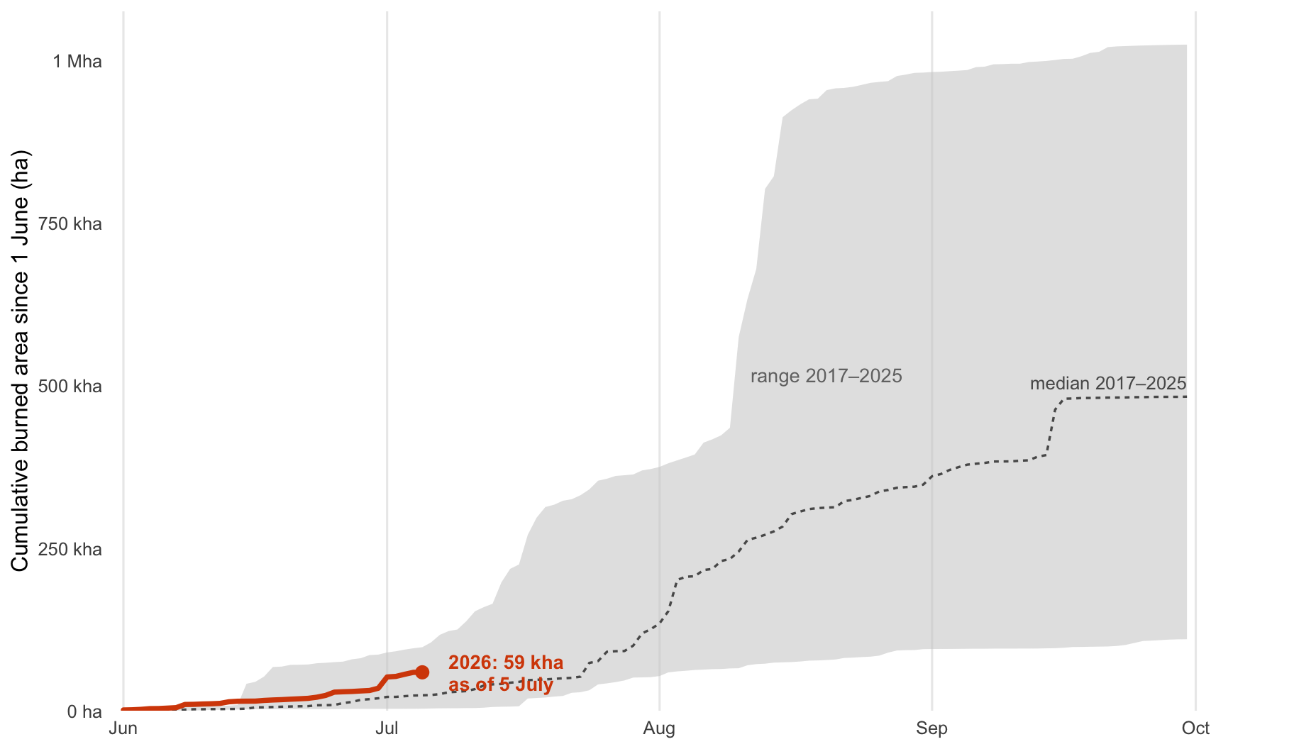
Read this like a race against the past. The grey band is the space between
the calmest and the most severe of the last nine seasons, day by day. The
dashed line is the middle of the pack. The orange line is 2026, and it stops
where the data stops, on `r as_of_lab`. Thirteen weeks in, 2026 is
`r if (is.na(pct_vs_med)) "not yet comparable to the median (too early in the season for a meaningful ratio)" else sprintf("running above the median (about %.1f times it)", pct_vs_med / 100)` and sits
high in the band: of the last nine seasons, only 2025 was further along at this
date.
That is a milder verdict than this page carried in late July, and the reason is
worth pausing on, because it is easy to misread as good news. On 26 July, 2026
was running at close to four times a typical season. It did not ease off for
a long while: it has burned roughly 8,000 hectares a day since then, against
about 6,000 a day earlier in the summer. What changed is the yardstick,
not the fire. August is when an ordinary European season does much of its own
burning, so the median line climbed steeply and closed most of the gap. My
honest reading is *clearly elevated, second only to 2025, and no longer the
lonely outlier it looked like in July*. Most of a European fire season happens
in July and August. September has only just begun, and I will not call a
season in week thirteen.
Something has changed since the middle of August, and it needs a careful
reading. The daily pace has fallen: about 3,200 hectares a day over the last
two weeks, and closer to 2,100 over the last one, against more than 8,000 a
day averaged since 26 July. That looks like a season running out of steam,
and part of it genuinely is. But part of it is an artifact of how this data
arrives, and it would be easy to over-read.
::: {.callout-note title="Why the last few days always look quiet"}
EFFIS maps fires as usable satellite imagery arrives, so the most recent days
are the least complete and keep filling in afterwards. That is measurable
rather than hypothetical. The previous snapshot, taken on 25 August, reported
about 619,000 hectares burned between 1 June and 24 August. This week's
snapshot, looking at those very same dates, reports about 647,000: roughly
27,000 hectares, or 4%, showed up after the fact. So read the end of the
orange line as a floor that will
rise, not as a finished measurement. The quiet last week on this page will look
busier on next week's.
:::
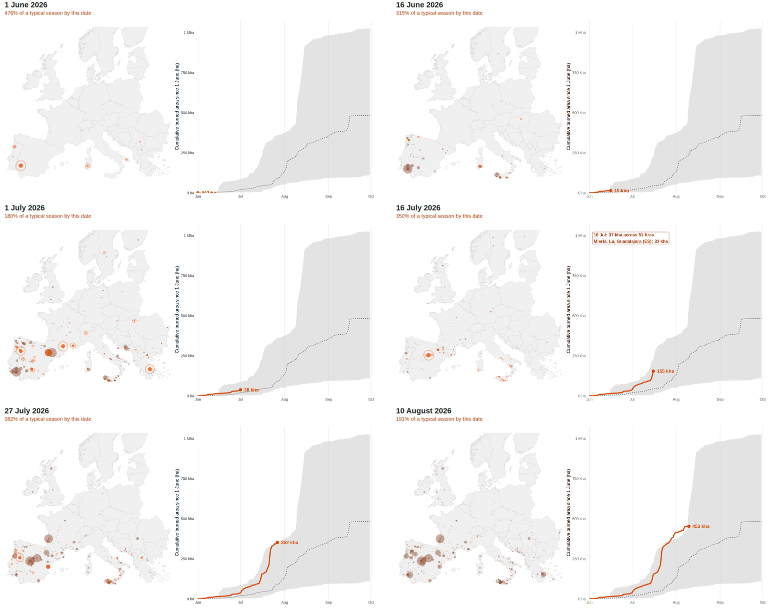
### The same season, played back
The chart above compresses thirteen weeks into one frame, which is exactly what
makes a step in the line easy to read past. So here is the same data at its own
pace: the map and the line locked to one clock, one frame per day. A fire
flares bright on the day it is mapped, glows for two more, then settles to a
scar, and the ring around it is sized by area, so a megafire announces itself
rather than becoming one pixel among thousands. The animation holds for a beat
on the three biggest days.
Watch 22 July. Two rings open almost together, one over the Gironde and one
over Ávila: about 42,000 hectares in Spain and 37,000 in France on the same
day. The line jumps by roughly 87,000 hectares in one step, and the readout
above it climbs to more than six times a typical season. Then watch 6 August,
much further southwest, when a single fire in Huelva adds about 44,000 more.
Those two days are worth comparing, because they show the season changing
character. In late July, 22 July alone accounted for most of the distance
between 2026 and an ordinary year. It no longer does: the burning has kept
coming since, and that one day is now less than a third of the gap.
::: {#fig-race}
{fig-alt="Two-panel animation: a map of Europe accumulating wildfire perimeters day by day beside the cumulative burned-area chart drawing itself against the 2017-2025 range."}
The 2026 season played back day by day, 1 June to `r as_of_lab`. Left: mapped
perimeters accumulating, coloured by age (bright on the day of mapping, then
fading to a muted scar); dot and ring radius scale with the square root of
burned area, so marker size is proportional to area. Right: the same cumulative
burned-area chart as above, drawn to the same date, against the 2017-2025
min-max band (grey) and median (dashed). The header reports the running total
as a percentage of the historical median for that calendar date. Playback holds
on the three largest burn days, which are annotated with the fires that drove
them (any fire contributing at least 10% of that day's area). The map viewport
is framed on the 1st-99th percentile of fire locations, so a few outlying
Nordic and Irish fires sit near or just beyond the edge. Source: EFFIS rapid
perimeters, snapshot `r basename(snap)`; geometry in EPSG:3035.
:::
## Does Europe only burn in summer?
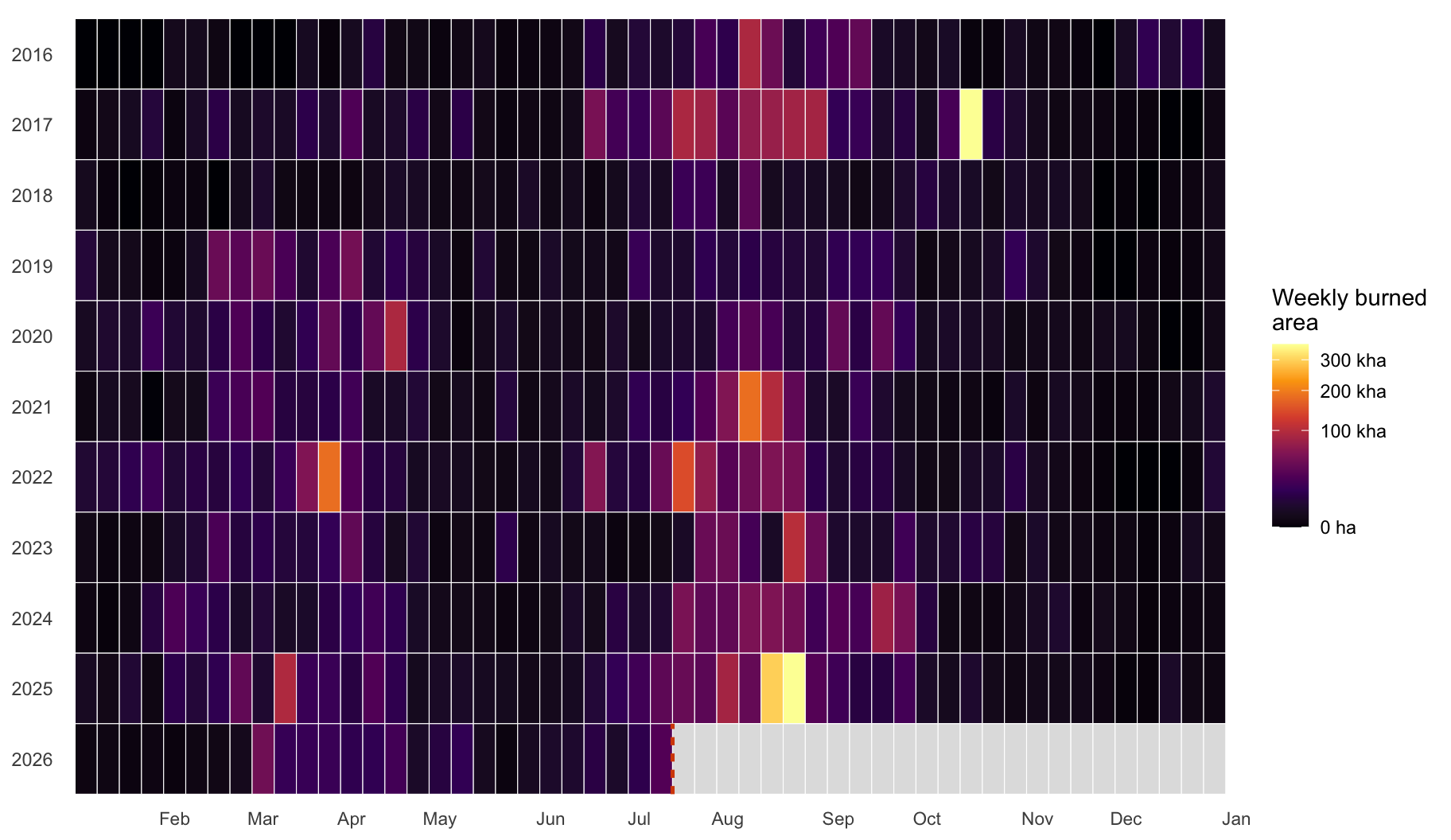
Not entirely, and 2026 makes the exception hard to miss. The chart below
stacks eleven years, calendar week by calendar week, so a season's full
rhythm is visible at once.
```{r}
#| label: calendar-heatmap
#| fig-width: 9.5
#| fig-height: 5.5
#| fig-cap: !expr cap_calendar
weekly_area <- build_weekly_area(
  years = CALENDAR_YEARS, current_year = YEAR_CURRENT,
  current_tagged = tagged_2026_full, snapshot_dir = snap, eu = eu, lc_cols = lc_cols
)

cal_grid <- prepare_calendar_grid(weekly_area, CALENDAR_YEARS, YEAR_CURRENT, as_of)
cal_cutoff_week <- min(lubridate::isoweek(as_of), 52L)

plot_calendar_heatmap(cal_grid, YEAR_CURRENT, cal_cutoff_week)
```
```{r}
#| label: calendar-numbers
peak_2026 <- cal_grid |>
  dplyr::filter(year == YEAR_CURRENT, !is.na(area_ha)) |>
  dplyr::slice_max(area_ha, n = 1, with_ties = FALSE)
peak_2026_date <- iso_week_start(YEAR_CURRENT, peak_2026$iso_week)
peak_2026_lab  <- paste(day(peak_2026_date), month.abb[month(peak_2026_date)])
```
Two patterns jump out. First, most years share the same silhouette: a dark
block across July and August and comparatively little else. Second, 2026's
own row stands out twice over: a bright stretch of late-winter and
early-spring weeks that most other years do not show at this intensity, and
then the familiar summer block arriving on top of it. The winter stretch is
the unusually busy January-to-May window from the introduction. The single
busiest week of 2026 so far, though, is a summer one, the week of
`r peak_2026_lab`, when about `r lab_si_ha(peak_2026$area_ha)` burned in that
single week alone, now outpacing even that winter surge. The grey band
on the right marks weeks that have not happened yet: the row simply stops
there, rather than being padded with zeros.
::: {.callout-note title="Reading this chart honestly"}
- The fill is burned **area**, not fire counts. The detection system changed
in 2023 to 2024, which would make later years look artificially busier if
counted by number of fires; area is far less affected.
- **2016** is the archive's first year. Its coverage, especially outside
summer, is less complete than later years, so read that row with extra
caution.
- The color scale is a square root, not a log. Many weeks genuinely burn
zero hectares, and a log scale cannot show a true zero.
:::
# Where did it burn?
With the timing question answered, the next one is geographic: where, across
the continent, did all of this actually happen?
```{r}
#| label: hero
#| fig-width: 9
#| fig-height: 7.5
#| fig-cap: !expr cap_hero
p_base <- ggplot() +
  geom_sf(data = eu$poly, fill = "grey95", color = "grey70", linewidth = 0.15) +
  coord_sf()

p_base +
  geom_sf(
    data = tagged_2026_full,
    fill = NA, color = "#D64A05", linewidth = 0.25, alpha = 0.8
  ) +
  theme_burns(base_size = 11, map = TRUE)
```
```{r}
#| label: facet-period
#| fig-width: 9.5
#| fig-height: 5
#| fig-cap: !expr cap_facet
tagged_2026_full <- tagged_2026_full |>
  mutate(period = factor(
    if_else(ba_date < as.Date(sprintf("%d-06-01", YEAR_CURRENT)),
            "January–May", paste("1 June –", as_of_lab)),
    levels = c("January–May", paste("1 June –", as_of_lab))
  ))

period_stats <- tagged_2026_full |>
  st_drop_geometry() |>
  group_by(period) |>
  summarise(n_fires = n(), burned_ha = sum(area_ha, na.rm = TRUE), .groups = "drop") |>
  mutate(lab = paste0("Fires: ", comma(n_fires), "\nArea: ", lab_si_ha(burned_ha)))

bb <- st_bbox(eu$poly)
period_stats <- period_stats |>
  mutate(
    x = bb["xmin"] + 0.03 * (bb["xmax"] - bb["xmin"]),
    y = bb["ymax"] - 0.03 * (bb["ymax"] - bb["ymin"])
  )

p_base +
  geom_sf(
    data = tagged_2026_full,
    fill = "#D64A05", alpha = 0.4, color = "#D64A05", linewidth = 0.08
  ) +
  facet_wrap(~ period, ncol = 2) +
  geom_label(
    data = period_stats, aes(x = x, y = y, label = lab), inherit.aes = FALSE,
    size = 3.1, label.size = 0, hjust = 0, vjust = 1,
    fill = alpha("white", 0.85), colour = "grey20"
  ) +
  theme_burns(base_size = 11, map = TRUE) +
  theme(strip.text = element_text(face = "bold"))
```
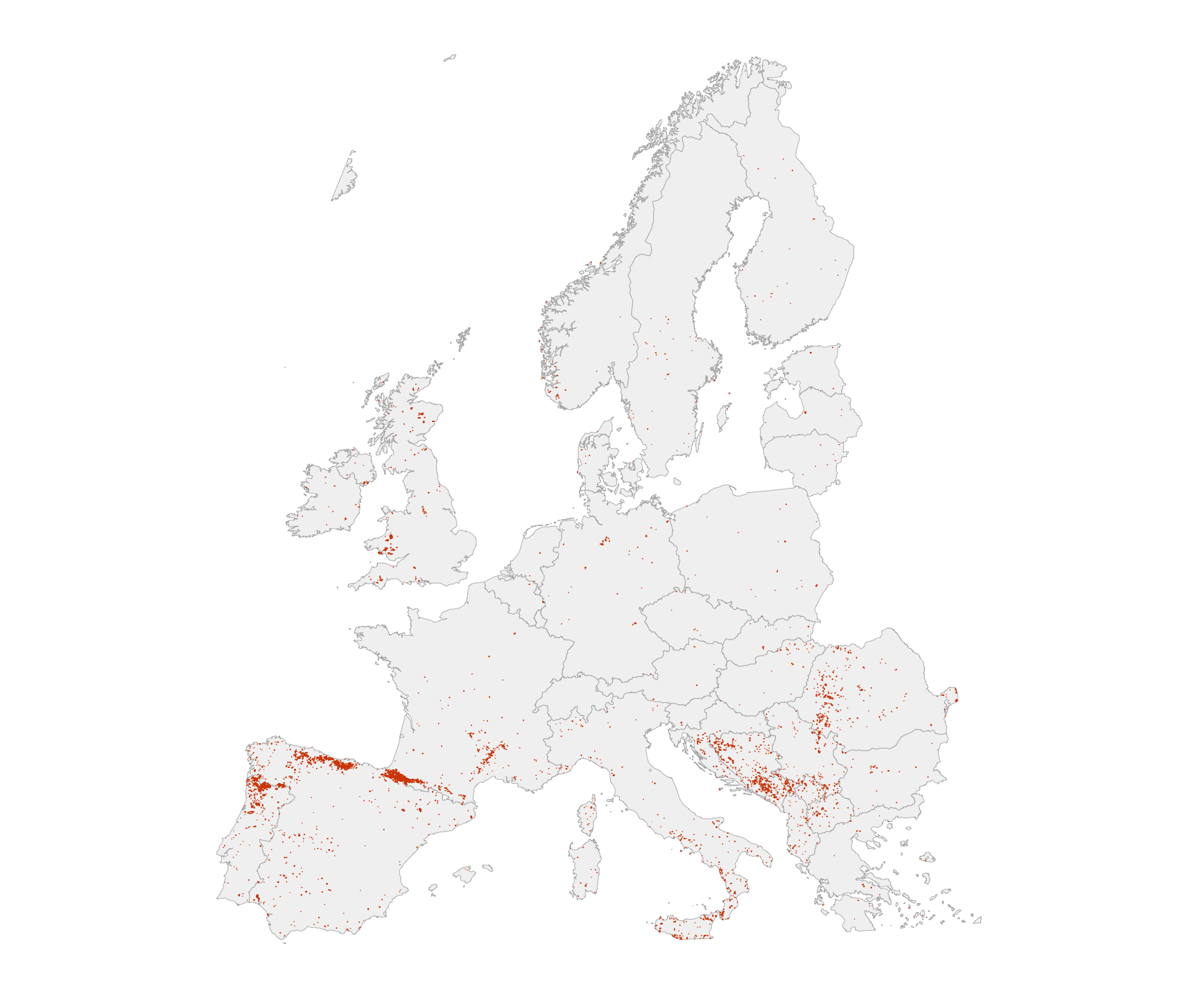
The map makes two things obvious: first, the familiar geography is already
in place: the Iberian Peninsula and the Mediterranean arc dominate the map.
Second, here is that winter surge again, now on the map: about
`r comma(round(full_ha - season_ha, -3))` of the
`r comma(round(full_ha, -3))` hectares were mapped between January and May,
visible in the left panel above. Keep that in mind when reading the summer
chart at the top: it deliberately leaves those months out.
## Explore the fires yourself
```{r}
#| label: leaflet-data
# Computed here, ahead of the prose below, so the sliver-drop share it quotes
# is a real inline value rather than an asserted "about 1%". The cache key
# does not need the snapshot identifier: it already includes asof<date>, and
# tagged_2026_full (its only input) is itself built from a snapshot-aware key
# upstream in get_tagged_window().
leaflet_result <- cached(sprintf("leaflet_2026_asof%s", format(as_of, "%Y%m%d")), {
  x <- tagged_2026_full |>
    mutate(across(all_of(lc_cols), to_num))

  lc_mat <- as.matrix(st_drop_geometry(x)[, lc_cols])
  lc_mat[is.na(lc_mat)] <- 0
  dom <- lc_labels[lc_cols[max.col(lc_mat, ties.method = "first")]]
  dom[rowSums(lc_mat) <= 0] <- "n/a"
  x$dominant_lc <- unname(dom)

  total_ha_before <- sum(x$area_ha, na.rm = TRUE)

  x <- x |>
    st_simplify(dTolerance = 100) |>       # ~100 m in EPSG:3035 (metric)
    filter(!st_is_empty(geometry))

  # leaflet only draws polygonal geometry: split GEOMETRYCOLLECTION rows
  # (simplify/clip byproducts) into their polygon parts, drop line slivers,
  # and cast everything to MULTIPOLYGON.
  types <- st_geometry_type(x)
  x_poly <- x[types %in% c("POLYGON", "MULTIPOLYGON"), ]
  x_gc   <- x[types == "GEOMETRYCOLLECTION", ]
  if (nrow(x_gc) > 0L) {
    x_poly <- rbind(x_poly, suppressWarnings(st_collection_extract(x_gc, "POLYGON")))
  }
  x_poly <- x_poly |>
    filter(!st_is_empty(geometry)) |>
    st_cast("MULTIPOLYGON") |>
    st_transform(4326)

  # Sliver-drop share quoted in prose: the area held by rows that degenerated
  # into pure lines/points (or emptied out entirely) after simplification,
  # and so never make it into x_poly, as a share of the pre-simplification
  # total -- NOT the much smaller boundary shrinkage of polygons that ARE
  # retained.
  retained_ha <- sum(x_poly$area_ha, na.rm = TRUE)
  sliver_pct <- 100 * (total_ha_before - retained_ha) / total_ha_before

  list(sf = x_poly, sliver_pct = sliver_pct)
}, version = 3)

leaf_sf <- leaflet_result$sf
sliver_pct_lab <- sprintf("%.1f%%", leaflet_result$sliver_pct)
```
Every 2026 fire, on a map you can pan and zoom. Click an outline for its
date, size, country, and the vegetation that dominated the ground it burned.
I simplified the shapes slightly (about 100 m of tolerance) to keep the page
fast; the tiniest border slivers, about `r sliver_pct_lab` of the total area,
drop out in the process. For survey-grade outlines, use the official EFFIS
viewer.
```{r}
#| label: leaflet
pal_period <- c("#3E8EC4", "#D64A05")  # winter-spring blue vs summer orange-red
leaflet(leaf_sf) |>
  addProviderTiles("CartoDB.Positron") |>
  addPolygons(
    weight = 0.7,
    color = ~if_else(period == "January–May", pal_period[1], pal_period[2]),
    fillColor = ~if_else(period == "January–May", pal_period[1], pal_period[2]),
    fillOpacity = 0.35,
    popup = ~sprintf(
      "<b>%s</b><br/>Date: %s<br/>Mapped area: %s ha<br/>Dominant land cover: %s",
      name_long, format(ba_date, "%Y-%m-%d"), comma(round(area_ha)), dominant_lc
    )
  ) |>
  addLegend(
    position = "bottomleft", colors = pal_period,
    labels = c("January–May", paste("1 June –", as_of_lab)),
    title = "2026 perimeters", opacity = 0.7
  )
```
# How big is a fire, really?
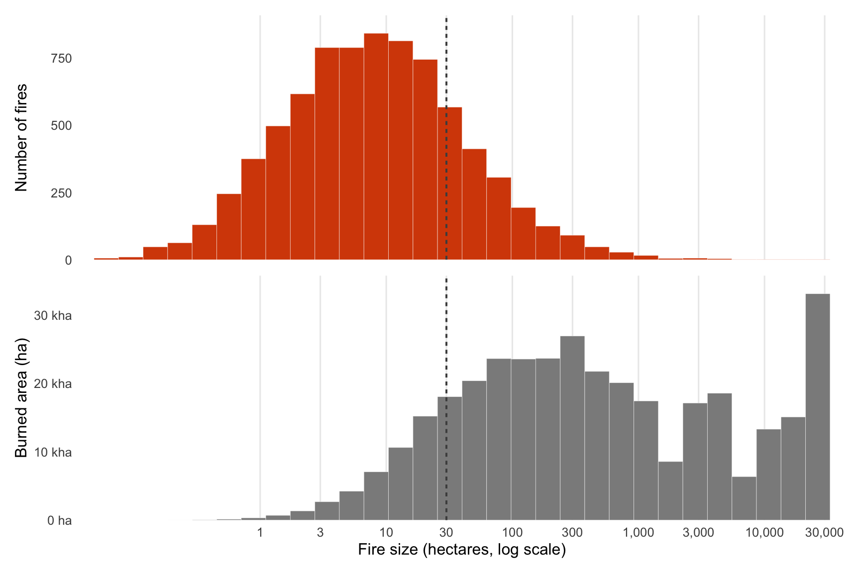
Here is the surprise hiding inside every map above: most of these fires are
small. The chart below splits the 2026 fires two ways on the same size axis.
That axis is logarithmic, so each step to the right multiplies the size
tenfold rather than adding a fixed amount, which is the only way to show fires
of two hectares and fires of thirty thousand on one line.
```{r}
#| label: fire-sizes-data
size_df <- tagged_2026_full |>
  st_drop_geometry() |>
  filter(is.finite(area_ha), area_ha > 0)

share_fires_small <- mean(size_df$area_ha < 30)
share_area_small  <- sum(size_df$area_ha[size_df$area_ha < 30]) / sum(size_df$area_ha)
median_fire_ha    <- median(size_df$area_ha)

cap_fire_sizes <- sprintf(
  paste(
    "Every 2026 fire (1 January – %s), split by size on a shared logarithmic",
    "axis. Top: how many fires fall in each size band. Bottom: how many hectares",
    "those same fires burned. The dashed line marks 30 hectares, the rough floor",
    "of the older MODIS-era mapping. Source: EFFIS rapid perimeters, snapshot %s;",
    "areas from Europe-clipped geometry in EPSG:3035."
  ),
  as_of_lab, basename(snap)
)
```
```{r}
#| label: fire-sizes
#| fig-width: 9
#| fig-height: 6
#| fig-cap: !expr cap_fire_sizes
plot_fire_sizes(tagged_2026_full)
```
The two panels lean opposite ways. The top one counts fires, and its weight
sits on the left: the large majority are well under 30 hectares, the size
EFFIS could barely see a few years ago. The bottom panel counts hectares
instead, and it tips to the right, where a handful of big fires hold nearly
all the burned area. Both things are true at once. By number, small fires
dominate; by area, a few giants do. About
**`r sprintf("%.0f%%", 100 * share_fires_small)`** of 2026's mapped fires are
under 30 hectares, yet they account for only about
**`r sprintf("%.0f%%", 100 * share_area_small)`** of the burned area, and the
typical fire is just `r round(median_fire_ha)` hectares. That gap is exactly
why this page measures burned area instead of counting fires: one large fire
says more about the season than a thousand tiny ones, and it is those giants
that the next section puts under the microscope.
# What does a giant fire actually look like?
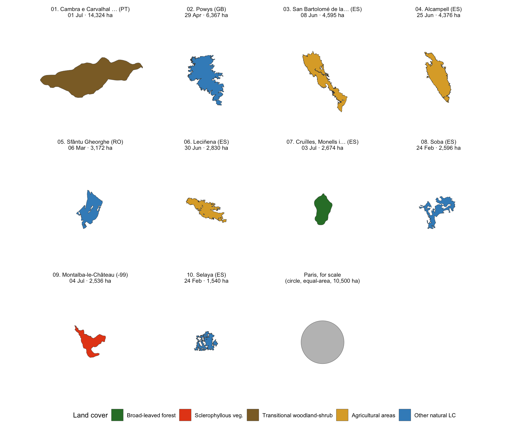
Scrolling through that map, numbers like "seven thousand hectares" are hard
to picture on their own. Below are the ten largest 2026 fires so far, each
drawn at the exact same scale, so size differences are visible rather than
just stated. A single grey circle, equal in area to the city of Paris, sits
alongside them for reference.
```{r}
#| label: gallery-data
# Built here (not in the shared setup chunk) because it only depends on
# tagged_2026_full, which the setup chunk already produced; the caption
# below needs gallery$half_side, so it is composed in this data chunk and
# only REFERENCED (via !expr) by the figure chunk that follows -- fig-cap
# options resolve before a chunk's own body runs, so a caption cannot depend
# on a value the same chunk is about to compute.
gallery <- build_gallery_scars(
  tagged_2026_full, n = 10L, lc_cols = lc_cols, lc_labels = lc_labels
)

cap_gallery <- sprintf(
  paste(
    "The ten largest 2026 fires by Europe-clipped area, each drawn at the same",
    "metric scale (a single shared window, about %.0f km across) so their true",
    "relative size is directly comparable; fill shows each fire's dominant",
    "land-cover class. The grey circle is not a fire: it is a circle of equal",
    "area to Paris intra-muros (about 105 km2, 10,500 ha), drawn for scale",
    "rather than traced from an official city boundary. Communes and country",
    "codes from EFFIS attributes; rapid perimeters are provisional and",
    "subject to revision. Source: EFFIS rapid perimeters, snapshot %s."
  ),
  gallery$half_side * 2 / 1000, basename(snap)
)
```
```{r}
#| label: gallery-scars
#| fig-width: 10.5
#| fig-height: 8.5
#| fig-cap: !expr cap_gallery
plot_gallery_scars(gallery)
```
Fires like these are not typical of the season. Across all
`r comma(full_n)` mapped 2026 perimeters, the largest 1% alone hold about
`r sprintf("%.0f%%", gallery$top1_share * 100)` of the season's total burned
area. Most fires are small. A handful of monsters like the ones above do
most of the damage, and the biggest one on the sheet, in
`r gallery$panels$place_lab[[1]]`, is already bigger than the Paris-sized
circle next to it.
## See it for yourself: drop each fire onto Paris
A grey circle is one way to picture "the size of Paris," but the real city
is not a circle. What if you could see a fire's true, ragged outline sitting
directly on the streets you might actually know? The map below does exactly
that: it takes the true shape of each of the `r nrow(gallery$meta)` fires
above and slides it onto the real municipal boundary of Paris, one fire at a
time, so the comparison is against the actual city rather than a stand-in
shape.
```{r}
#| label: paris-comparison-data
# Reuses gallery$panels/gallery$meta (already computed for the static
# figure above) rather than re-selecting or re-simplifying the top-10 from
# scratch; build_paris_comparison() only adds a translation ("+ Paris
# centroid") on top of geometry build_gallery_scars() already produced.
# Cache key mirrors the leaflet-data chunk's convention above: asof<date>
# is enough because gallery (its only input besides the static Paris
# boundary asset) is itself built from snapshot-aware tagged_2026_full.
paris_cmp <- cached(
  sprintf("paris_comparison_asof%s", format(as_of, "%Y%m%d")),
  build_paris_comparison(gallery),
  version = 1
)

paris_fires <- paris_cmp$fires_wgs84 |>
  mutate(
    fill_col = unname(pal_lc[dominant_lc]),
    times_paris = area_ha / paris_cmp$paris_ha,
    group_label = sprintf(
      "%s. %s (%s), %s ha", rank, commune, iso_a2, comma(round(area_ha))
    ),
    popup_html = sprintf(
      paste(
        "<b>%02d. %s</b><br/>Country: %s<br/>Date: %s<br/>",
        "Mapped area: %s ha<br/><b>%.1f×</b> the area of Paris (%s ha)"
      ),
      as.integer(rank), commune, name_long, format(ba_date, "%Y-%m-%d"),
      comma(round(area_ha)), times_paris, comma(round(paris_cmp$paris_ha))
    )
  )
```
::: {.callout-note title="Read this map honestly"}
- These fires never happened anywhere near Paris. Their real locations are
on the maps earlier in this post; here, each outline is **moved** so its
size can be compared directly to a familiar shape.
- Paris's own outline is its real municipal boundary (INSEE code 75056,
not a circle this time), about
`r comma(round(paris_cmp$paris_ha))` hectares by this geometry (close to,
but not identical to, the round 10,500 ha used as a reference constant
elsewhere on this page). Boundary data:
[france-geojson](https://github.com/gregoiredavid/france-geojson)
(Etalab, Licence Ouverte).
- Pick a fire from the list on the right; only one outline is shown at a
time, so sizes are never visually stacked on top of each other.
:::
```{r}
#| label: paris-comparison-leaflet
# One dark, permanent outline (never toggles) for Paris itself, plus one
# leaflet GROUP per fire; addLayersControl(baseGroups = ...) makes group
# selection mutually exclusive (radio-style), and hideGroup() on every
# label but the first leaves fire 01 selected by default.
combined_geom <- c(sf::st_geometry(paris_cmp$paris_wgs84), sf::st_geometry(paris_fires))
bbox_all <- sf::st_bbox(combined_geom)

paris_map <- leaflet(width = "100%", height = 520) |>
  addProviderTiles("CartoDB.Positron") |>
  addPolygons(
    data = paris_cmp$paris_wgs84,
    color = "#1A1A1A", weight = 2.4, fill = FALSE, opacity = 0.9
  ) |>
  fitBounds(
    lng1 = unname(bbox_all["xmin"]), lat1 = unname(bbox_all["ymin"]),
    lng2 = unname(bbox_all["xmax"]), lat2 = unname(bbox_all["ymax"])
  )

paris_map <- purrr::reduce(seq_len(nrow(paris_fires)), function(map_acc, i) {
  row_i <- paris_fires[i, ]
  addPolygons(
    map_acc,
    data = row_i, group = row_i$group_label,
    color = "grey20", weight = 1,
    fillColor = row_i$fill_col, fillOpacity = 0.55,
    popup = row_i$popup_html
  )
}, .init = paris_map)

paris_map <- paris_map |>
  addLayersControl(
    baseGroups = paris_fires$group_label,
    options = layersControlOptions(collapsed = FALSE),
    position = "topright"
  )

# Default selection: fire 01 (already the largest, per gallery's arrange()).
paris_map <- purrr::reduce(
  paris_fires$group_label[-1],
  function(map_acc, g) hideGroup(map_acc, g),
  .init = paris_map
)

paris_map
```
# Which countries are hit hardest so far?
Individual fires are dramatic on their own; country totals show where the
season is landing hardest overall.
```{r}
#| label: countries
#| fig-width: 12
#| fig-height: 5.5
#| fig-cap: !expr cap_countries
ctry_2026 <- tagged_2026_full |>
  st_drop_geometry() |>
  group_by(name_long) |>
  summarise(burned_ha = sum(area_ha, na.rm = TRUE), n_fires = n(), .groups = "drop") |>
  left_join(country_land_area(eu), by = "name_long") |>
  mutate(pct_land = 100 * burned_ha / land_area_ha)

top10 <- ctry_2026 |>
  slice_max(burned_ha, n = 10)

flags <- flag_table(top10$name_long, eu$poly)
top10 <- top10 |>
  left_join(flags, by = "name_long") |>
  # factor AFTER the join: joining a factor to a character column silently
  # coerces name_long back to character, which would both scramble the bar
  # order (alphabetical) and break the numeric y positions for the flags
  mutate(name_long = fct_reorder(name_long, burned_ha))

max_x <- max(top10$burned_ha)

# Flag PNGs drawn with base annotation_raster() (no extra image package
# needed): one raster layer per country, placed just right of its bar.
# Discrete y positions are the factor level codes (1..10).
flag_df <- top10 |>
  filter(!is.na(flag_path)) |>
  mutate(y_pos = as.integer(name_long))
flag_layers <- lapply(seq_len(nrow(flag_df)), function(i) {
  x0 <- flag_df$burned_ha[i] + 0.05 * max_x
  annotation_raster(
    png::readPNG(flag_df$flag_path[i]),
    xmin = x0, xmax = x0 + 0.08 * max_x,
    ymin = flag_df$y_pos[i] - 0.28, ymax = flag_df$y_pos[i] + 0.28
  )
})

p_raw <- ggplot(top10, aes(x = burned_ha, y = name_long)) +
  geom_col(fill = "grey90") +
  geom_point(aes(color = col), size = 3) +
  scale_color_identity() +
  flag_layers +
  scale_x_continuous(labels = lab_si_ha, expand = expansion(mult = c(0, 0.18))) +
  labs(x = "Burned area (ha)", y = NULL) +
  theme_burns(base_size = 12) +
  coord_cartesian(clip = "off")

p_pct <- ggplot(top10, aes(x = pct_land, y = name_long)) +
  geom_segment(aes(x = 0, xend = pct_land, yend = name_long, color = col),
               linewidth = 1.1, show.legend = FALSE) +
  geom_point(aes(color = col), size = 3.2) +
  scale_color_identity() +
  scale_x_continuous(labels = label_percent(scale = 1),
                     expand = expansion(mult = c(0, 0.08))) +
  labs(x = "Share of national land area", y = NULL) +
  theme_burns(base_size = 12) +
  theme(axis.text.y = element_blank())

# plot_spacer() inserts a gap column between the two panels so the left
# panel's rightmost x-axis label (e.g. "150 kha") and its flags do not collide
# with the right panel's leftmost label ("0.0%").
p_raw + plot_spacer() + p_pct +
  plot_layout(widths = c(3, 0.25, 2))
```
`r top10$name_long[which.max(top10$burned_ha)]` leads the raw ranking with
about **`r comma(round(max(top10$burned_ha), -3))` hectares** so far. But raw
hectares flatter big countries. The right panel asks a fairer question: how
much of the country's *own* land has burned? Small countries can be hit much
harder relative to their size, and that is where the order reshuffles.
One shift is worth naming this week. While Iberia stayed almost flat, the
south and east did not. Italy added the most of any country since the last
update, about 15,000 hectares, partly from late-August fires in Puglia, Sicily
and Basilicata and partly from earlier fires mapped late. Montenegro added
roughly 10,000 hectares, a large amount for a country its size, and Bosnia and
Herzegovina, North Macedonia and Serbia kept climbing. Bosnia still sits fifth
in Europe for the year. The centre of gravity of this season has been moving
east and south since mid-August, even as the Europe-wide total slowed.
# Is fire returning to old scars?
Some land burns again and again. To see how much of 2026 falls on ground that
already burned recently, I merged all the fire outlines from 2017 to 2025
into one big historical footprint, then checked how much of this year's
burned area lands inside it.
```{r}
#| label: reburn
#| fig-width: 9
#| fig-height: 7.5
#| fig-cap: !expr cap_reburn
footprint <- get_historical_footprint(HIST_YEARS, snap, eu, tol_m = 100)

reburn <- cached(
  sprintf("reburn_2026_asof%s_tol100", format(as_of, "%Y%m%d")),
  compute_reburn(tagged_2026_full, footprint),
  version = 1
)

reburn_layers <- rbind(
  st_sf(kind = "First-time burn (not in 2017–2025 scars)", geometry = reburn$new_geom),
  st_sf(kind = "Re-burn of a 2017–2025 scar", geometry = reburn$reburn_geom)
)

ggplot() +
  geom_sf(data = eu$poly, fill = "grey95", color = "grey70", linewidth = 0.15) +
  geom_sf(data = reburn_layers, aes(fill = kind, color = kind),
          linewidth = 0.1, alpha = 0.65) +
  scale_fill_manual(values = c(
    "First-time burn (not in 2017–2025 scars)" = "#D64A05",
    "Re-burn of a 2017–2025 scar" = "#1F78B4"
  ), name = NULL) +
  scale_color_manual(values = c(
    "First-time burn (not in 2017–2025 scars)" = "#D64A05",
    "Re-burn of a 2017–2025 scar" = "#1F78B4"
  ), name = NULL) +
  theme_burns(base_size = 11, map = TRUE) +
  theme(legend.position = "bottom")
```
On the map, Spain's fires overwhelmingly break new ground, while France,
Portugal and Italy return several times more often to ground that has already
burned since 2017. That contrast has held all season, and Spain's August fires
in Huelva and Aragón reinforced it rather than softening it.
```{r}
#| label: aude-numbers
aude_rows <- tagged_2026_full |>
  st_drop_geometry() |>
  filter(!is.na(province), grepl("Aude", province, fixed = TRUE))
aude_n  <- nrow(aude_rows)
aude_ha <- sum(aude_rows$area_ha, na.rm = TRUE)

fr_rows <- tagged_2026_full |> st_drop_geometry() |> filter(name_long == "France")
fr_n  <- nrow(fr_rows)
fr_ha <- sum(fr_rows$area_ha, na.rm = TRUE)
```
The headline: about **`r sprintf("%.0f%%", 100 * reburn$reburn_share)`** of
2026's burned area (roughly `r comma(round(reburn$reburn_ha, -3))` of
`r comma(round(reburn$total_ha, -3))` hectares) sits on land that already
burned at least once since 2017. That is not automatically bad news.
Mediterranean shrubland and many pine forests are fire-adapted: they regrow
quickly after a burn, and that fresh growth is often exactly the kind of
fine, dry fuel that carries a fire well again a few years later. Repeated
burning on a short cycle has long been part of how these landscapes work.
What the share does not tell us is whether any single re-burn was more or
less severe than the fire before it, or whether the gap between fires is
shrinking: it is a description of overlap, not a verdict on land condition.
Treat the exact figure as an estimate too. Both layers are rapid mapping
products, and I simplified the shapes to keep the computation tractable.
I still check on Aude every season now, since it's where this whole project
started:
`r if (aude_n > 0) sprintf("the Aude département in France does show 2026 activity: %d mapped fire%s totalling about %s hectares so far.", aude_n, if (aude_n > 1) "s" else "", comma(round(aude_ha, -2))) else "the Aude département in France shows no mapped 2026 fire in this snapshot so far (a real zero, not a data gap)."`
France as a whole stands at about `r comma(round(fr_ha, -2))` hectares across
`r comma(fr_n)` mapped fires this year.
# What is actually burning?
Beyond where fire keeps coming back, there is a second question worth
asking: is this season eating into different vegetation than usual? To
compare fairly, I use identical calendar windows: what burned between
**1 June and
`r as_of_lab`** this year, against what burned in the very same window in the
nine previous seasons pooled together.
```{r}
#| label: landcover
#| fig-width: 9.5
#| fig-height: 3.6
#| fig-cap: !expr cap_landcover
cutoff_md <- format(as_of, "%m-%d")

lc_share <- function(df, label) {
  df |>
    mutate(across(all_of(lc_cols), to_num)) |>
    summarise(across(all_of(lc_cols), ~ sum(.x / 100 * area_ha, na.rm = TRUE))) |>
    pivot_longer(everything(), names_to = "class", values_to = "lc_ha") |>
    mutate(share = lc_ha / sum(lc_ha), group = label)
}

lc_hist <- map_dfr(HIST_YEARS, function(y) {
  get_tagged_window(
    y, snap, eu,
    start_date = as.Date(sprintf("%d-06-01", y)),
    end_date   = as.Date(paste0(y, "-", cutoff_md))
  ) |>
    st_drop_geometry() |>
    mutate(year = y)
})

lc_2026 <- get_tagged_summer(YEAR_CURRENT, snap, eu,
                             SEASON_START_MONTH, SEASON_END_MONTH) |>
  st_drop_geometry() |>
  filter(ba_date <= as_of)

shares_2026 <- lc_share(lc_2026, sprintf("2026 (Jun 1 – %s %d)", month.abb[month(as_of)], day(as_of)))
shares_hist <- lc_share(lc_hist, "2017–2025 average\n(same window)")

lc_comp <- bind_rows(shares_2026, shares_hist) |>
  mutate(
    class = factor(lc_labels[class], levels = names(pal_lc)),
    group = fct_rev(factor(group, levels = unique(group)))
  )

# Largest 2026-vs-history composition gap, quoted (stale-proof) in the prose
lc_gap <- shares_2026 |>
  select(class, share_cur = share) |>
  left_join(shares_hist |> select(class, share_hist = share), by = "class") |>
  mutate(class_label = lc_labels[class], gap = share_cur - share_hist) |>
  slice_max(abs(gap), n = 1)

ggplot(lc_comp, aes(x = share, y = group, fill = class)) +
  geom_col(width = 0.62, color = NA) +
  geom_text(
    aes(
      label = if_else(share >= 0.07, label_percent(accuracy = 1)(share), ""),
      group = class
    ),
    position = position_stack(vjust = 0.5),
    color = "white", size = 3.3, fontface = "bold"
  ) +
  scale_fill_manual(values = pal_lc, breaks = names(pal_lc), name = "Land cover") +
  scale_x_continuous(labels = label_percent(), expand = expansion(mult = c(0, 0.01))) +
  labs(
    x = "Share of burned area", y = NULL,
    caption = "Pooled 2017–2025 shares are area-weighted across all nine years' same-window fires."
  ) +
  theme_burns(base_size = 12)
```
Compare the two bars: where they differ is where this season deviates from
the recent norm. Right now the biggest gap is **`r lc_gap$class_label`**, at
`r label_percent(accuracy = 1)(lc_gap$share_cur)` of this season's burned
area versus `r label_percent(accuracy = 1)(lc_gap$share_hist)` in a typical
early season. Read the bars as *what burned*, not as what burns easily: they
describe the landscape the fires happened to cross.
::: {.callout-note title="What the land-cover classes mean" collapse="true"}
- **Broad-leaved forest**: deciduous trees (oaks, beeches).
- **Coniferous forest**: needle-leaf trees (pines, spruces, firs), including
plantations.
- **Mixed forest**: broad-leaved and coniferous stands together.
- **Sclerophyllous vegetation**: fire-adapted Mediterranean shrubland
(maquis, garrigue); evergreen, waxy leaves.
- **Transitional woodland-shrub**: open, regenerating or degraded woodland,
shrub mosaics, young stands.
- **Agricultural areas**: arable land, permanent crops, pastures.
- **Artificial surfaces**: urban and built-up areas, infrastructure.
- **Other natural LC**: natural cover not listed above (heath, sparse
vegetation, dunes, rocky ground).
- **Other LC**: residual or unknown classes.
:::
# How much of this is happening in protected nature?
One more lens on what burned: how much of it sits inside land specifically
protected for nature?
::: {.callout-note title="What is Natura 2000?"}
Natura 2000 is the European Union's network of protected natural sites,
covering habitats and species the EU has agreed are worth safeguarding. It
is not a fire ban. Many Natura 2000 landscapes, especially Mediterranean
scrub and some forest types, are fire-adapted ecosystems where occasional
burning is part of their natural cycle. A fire inside a protected site is
not automatically a disaster, but tracking how much burning happens there is
still useful context.
:::
EFFIS tags every perimeter with the share of its own area that falls inside
a Natura 2000 site. The chart below turns that into a season-by-season
series, using the same 1 June cutoff every year so the comparison is fair.
```{r}
#| label: natura-trend
#| fig-width: 8
#| fig-height: 4.2
#| fig-cap: !expr cap_natura_trend
natura_trend <- build_natura_trend(
  hist_years = HIST_YEARS, year_current = YEAR_CURRENT,
  current_tagged = tagged_2026_full, snapshot_dir = snap, eu = eu, cutoff_md = cutoff_md
)

plot_natura_trend(natura_trend, YEAR_CURRENT)
```
```{r}
#| label: natura-numbers
natura_2026       <- natura_trend |> dplyr::filter(year == YEAR_CURRENT)
natura_hist_median <- stats::median(natura_trend$share[natura_trend$year != YEAR_CURRENT], na.rm = TRUE)
```
Weighting by area, about `r sprintf("%.0f%%", natura_2026$share * 100)` of
2026's burned area in this window sits inside a Natura 2000 site, against a
`r sprintf("%.0f%%", natura_hist_median * 100)` median for 2017-2025 by the
same date. The map below shows exactly which 2026 scars carry a high
protected-area share; grey outlines mark fires with none.
```{r}
#| label: natura-map
#| fig-width: 8
#| fig-height: 6.5
#| fig-cap: !expr cap_natura_map
plot_natura_map(tagged_2026_full, eu)
```
# France and Spain, each against its own past
Two countries are carrying most of 2026, and it is worth seeing each on its own
terms, against its own recent history rather than Europe's. The two charts below
repeat the race-against-the-past idea from the top of the page, once for France
and once for Spain: the grey band is that country's own 2017 to 2025 range, and
the orange line is 2026 to date.
```{r}
#| label: france-spain-numbers
fs_df <- tagged_2026_full |> st_drop_geometry()

# Gironde (the departement around Bordeaux)
gir     <- fs_df |> dplyr::filter(!is.na(province), province == "Gironde")
gir_big <- gir |> dplyr::slice_max(area_ha, n = 1, with_ties = FALSE)

# Provinces ringing Madrid (Sierra de Gredos / Guadarrama). "vila$" matches
# "Avila" without depending on the accent byte encoding of the province field.
madrid_ring <- fs_df |> dplyr::filter(
  !is.na(province), grepl("vila$|Guadalajara|^Madrid$|Segovia", province)
)
madrid_ring_ha <- sum(madrid_ring$area_ha, na.rm = TRUE)
navaluenga <- fs_df |> dplyr::filter(grepl("Navaluenga", dplyr::coalesce(commune, ""))) |>
  dplyr::slice_max(area_ha, n = 1, with_ties = FALSE)

# Largest fire inside the Comunidad de Madrid itself. Selected by PROVINCE, not
# by commune name: EFFIS re-attributes communes between snapshots as perimeters
# are refined (the 2026-07-23 fire was mapped under San Martin de Valdeiglesias
# in the 26 July snapshot and under Navas del Rey in the 20 August one), which
# silently collapsed a commune-name filter to a 35 ha fire and rounded the
# prose figure to "0 hectares". Province is the stable unit here.
madrid_big <- fs_df |> dplyr::filter(!is.na(province), province == "Madrid") |>
  dplyr::slice_max(area_ha, n = 1, with_ties = FALSE)

# Season-wide largest fire, so the prose never hardcodes which fire leads.
biggest_fire <- fs_df |> dplyr::slice_max(area_ha, n = 1, with_ties = FALSE)

# English date labels, locale-proof (see as_of_lab in the setup chunk)
date_lab <- function(d) paste(lubridate::day(d), month.name[lubridate::month(d)])

cap_env_fr <- sprintf(paste(
  "Cumulative burned area in France since 1 June: 2026 to date against the",
  "2017-2025 range. The shaded band spans the minimum and maximum cumulative",
  "trajectory of the nine previous seasons on each day of the season; the dashed",
  "line is their median. The 2026 line stops at its last mapped perimeter (%s)."
), as_of_lab)
cap_env_es <- sprintf(paste(
  "Cumulative burned area in Spain since 1 June: 2026 to date against the",
  "2017-2025 range. The shaded band spans the minimum and maximum cumulative",
  "trajectory of the nine previous seasons on each day of the season; the dashed",
  "line is their median. The 2026 line stops at its last mapped perimeter (%s)."
), as_of_lab)
```
```{r}
#| label: envelope-france
#| fig-width: 9.5
#| fig-height: 5
#| fig-cap: !expr cap_env_fr
env_fr <- build_envelope(
  HIST_YEARS, YEAR_CURRENT, snap, eu,
  SEASON_START_MONTH, SEASON_END_MONTH, as_of_date = as_of, country = "France"
)
plot_envelope(env_fr)
```
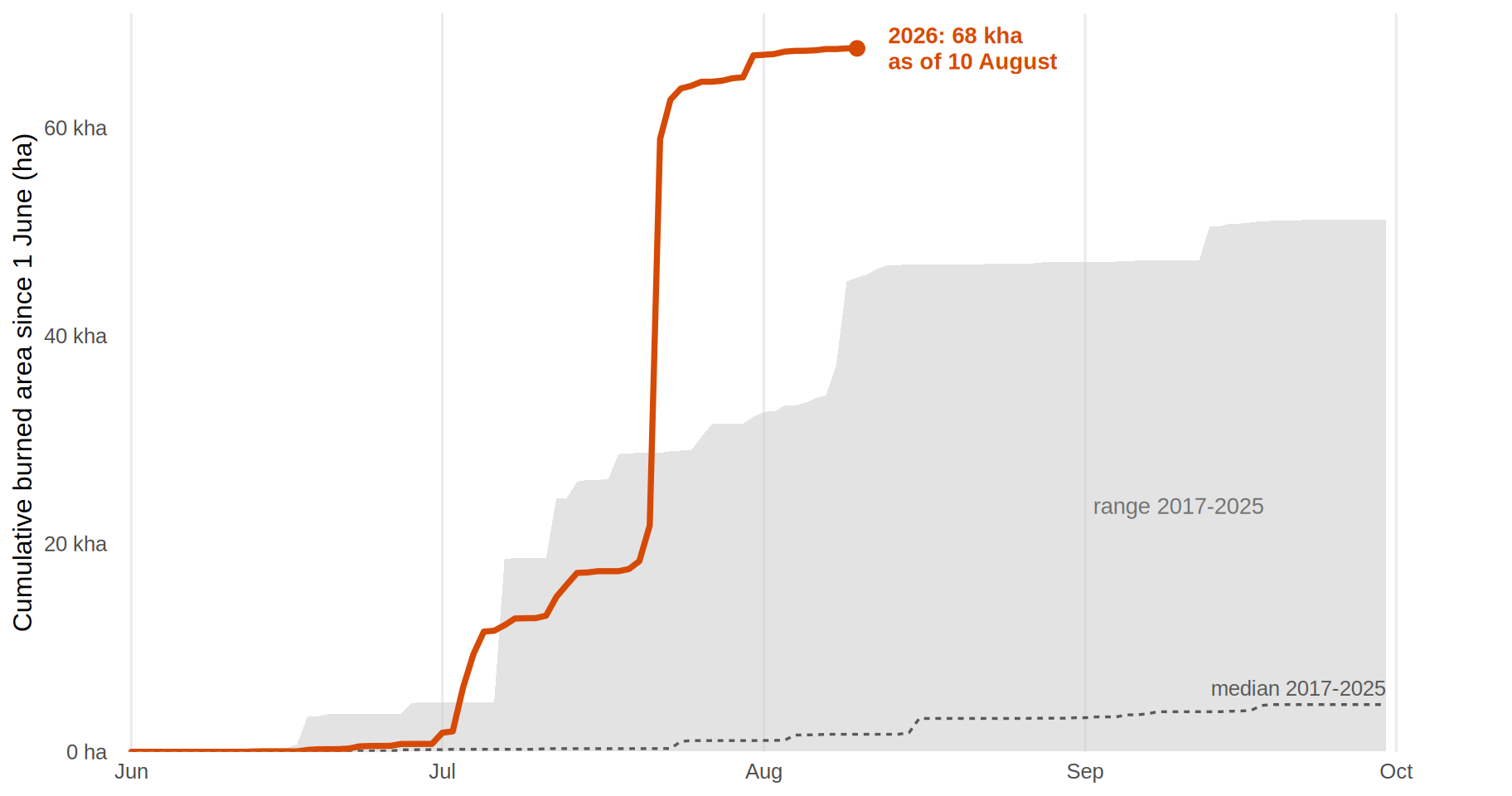
France has now passed one hundred thousand hectares for the year, and its 2026
line has pulled clear of every recent summer except 2022. A single fire is most
of that recent jump, and it is close to home for me. As a French reader I have
followed this Atlantic coast for years, and for the first seven weeks of the
season the Gironde, the département around Bordeaux, had not recorded a single
mapped fire. Then, on `r date_lab(gir_big$ba_date)`, the Médoc pine forest at Le
Porge burned: about **`r comma(round(gir_big$area_ha, -3))` hectares** in one
fire, more than the whole of Gironde's catastrophic 2022 season put together. A
burn that size on that coast is not something I can look past, and I am watching
it closely as the season runs on.
```{r}
#| label: envelope-spain
#| fig-width: 9.5
#| fig-height: 5
#| fig-cap: !expr cap_env_es
env_es <- build_envelope(
  HIST_YEARS, YEAR_CURRENT, snap, eu,
  SEASON_START_MONTH, SEASON_END_MONTH, as_of_date = as_of, country = "Spain"
)
plot_envelope(env_es)
```
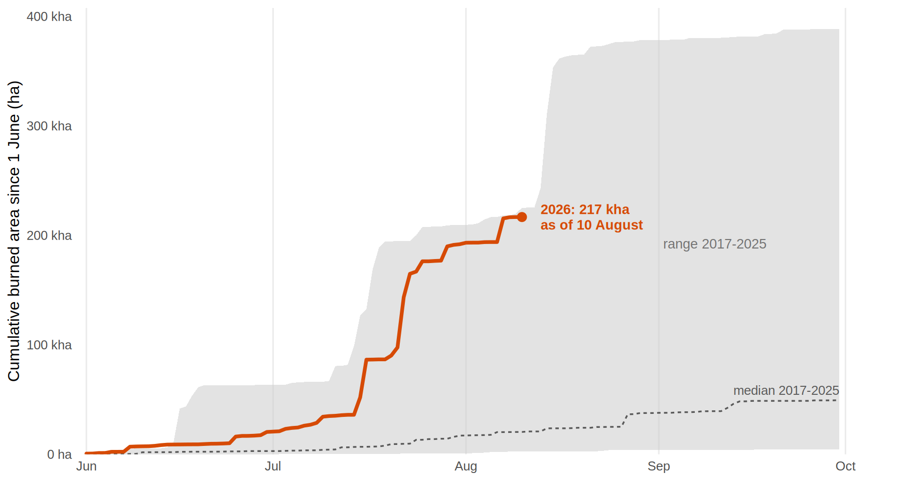
Spain is the heavier story, running far above anything in its own recent record,
and it has now produced two separate surges rather than one. The first sits in
the mountains ringing Madrid: the Sierra de Gredos and the ranges north of the
capital. About **`r comma(round(navaluenga$area_ha, -3))` hectares** burned at
Navaluenga in Ávila on `r date_lab(navaluenga$ba_date)`, and
`r madrid_big$commune`, inside the Comunidad de Madrid itself, added about
`r comma(round(madrid_big$area_ha, -3))` hectares the next day. Taken together,
the provinces around Madrid account for roughly
`r comma(round(madrid_ring_ha, -3))` hectares this year.
The second surge came in August, and it moved the record. The largest single
fire of the 2026 season so far is no longer in the Madrid ring at all: about
**`r comma(round(biggest_fire$area_ha, -3))` hectares** at
`r biggest_fire$commune` in `r biggest_fire$province`, mapped on
`r date_lab(biggest_fire$ba_date)`, in the Atlantic southwest of Andalusia
rather than the central mountains. Aragón followed four days later, with
another large fire in the Huesca pre-Pyrenees. This is the pattern worth
watching in the weeks left: 2026's Spanish burning is not staying in one place.
That is the season through `r as_of_lab`. July and August carry most of a
typical European fire season, and they are now behind us: 2026 leaves them
clearly above normal and second only to 2025. The question this page asked in
July, whether the early pace would hold or ease, now has an answer in two
parts. It held through the first half of August, and then eased markedly. How
markedly is not yet knowable, because the most recent days are still filling
in. What is left to watch is September, quiet in some years and the month
Iberia burns again in others, and the southern and eastern flank, Italy and
the western Balkans, which are still adding while Iberia has gone still. This
page updates weekly as new EFFIS outlines come in.
::: {.callout-note title="A final word of caution"}
Everything on this page is a rapid satellite estimate, not an official
statistic. Full methods and caveats are on the [About](../about.qmd) page.
:::