---
title: "Summer 2025 Wildfires in Europe: Where Did It Burn?"
subtitle: "EFFIS rapid perimeters, 1 June – 30 September 2025"
author: "Pierre Beaucoral"
date: 2025-09-09
execute:
freeze: auto
---
I had been wanting to understand Europe's wildfire season better for a while.
In 2025 it hit closer to home: I am French, and the fires in **Aude** stuck
with me, along with the big outbreaks in **Spain**. Rather than skim
headlines, I wanted a grounded view of *where* things burned, *how much*,
*when*, and *what actually burned*.
So I built a small, reproducible dataset and a handful of maps and charts for
**summer 2025** across Europe. This page is the result, and it is the analysis
the rest of this site grew out of. The [2026 tracker](2026.qmd) applies the
same method to the season now underway.
::: {.callout-note title="What this page is, and what changed since it was first published"}
This post was originally written in September 2025 against a local snapshot of
EFFIS perimeters, and it defined summer as June to August. It has since been
**rebuilt on the project's shared pipeline**: the same dated EFFIS snapshots,
country tagging, and equal-area geometry that produce every other page here.
Two things changed as a result, and both are improvements:
- **The season window is now 1 June to 30 September**, matching the tracker.
September 2025 was quiet, so this adds little area, but it makes 2025
directly comparable with every other year on the site.
- **The perimeters are the current, revised ones.** EFFIS corrects its rapid
mapping over time, and sharper Sentinel-2 imagery now maps far smaller fires
than the older MODIS-era product did. Totals here are therefore higher than
in the original September 2025 version, and a few of that version's
country-level comparisons no longer hold. Where that happens, the text below
reflects what the current data shows, not what the original said.
:::
::: {.callout-note title="Three things to know about these fire outlines"}
- **Most mapped fires are small, not big.** The original version of this post
repeated the common line that EFFIS maps fires of roughly 30 hectares and
up. On the current data that is not true: most 2025 summer perimeters are
under 30 hectares (the exact figure is below). The very smallest fires are
still missed, so totals stay below official statistics, but the
"30-hectare floor" framing is wrong and I have dropped it.
- **The outlines are rapid estimates**, revised as better imagery arrives.
- **I compare burned area, not fire counts.** The detection system changed
between 2023 and 2024 and suddenly saw many more small fires, so counting
fires across years is misleading; measuring area is much safer.
:::
```{r}
#| label: setup
# -------------------- Packages --------------------
library(sf)
library(dplyr)
library(tidyr)
library(tibble)
library(purrr)
library(lubridate)
library(forcats)
library(ggplot2)
library(scales)
library(janitor)
library(rnaturalearth)
library(ggimage)
library(ggrepel)
library(slider)
library(maptiles)
library(terra)
library(tidyterra)
library(ggspatial)
library(gganimate)

# GDAL caps single GeoJSON features at ~200 MB; the 2020 snapshot has one
# giant multipolygon above that (documented in scripts/fetch_effis.R).
Sys.setenv(OGR_GEOJSON_MAX_OBJ_SIZE = "0")

# -------------------- Shared helper library --------------------
source(file.path("R", "helpers.R"))   # to_num, parse_date_any, lab_si_ha
source(file.path("R", "geo.R"))       # Europe polygons, read_effis, tagging
source(file.path("R", "cache.R"))     # cached()
source(file.path("R", "theme.R"))     # pal_lc, burns_brand, theme_burns()
source(file.path("R", "flags.R"))     # flag_table()
source(file.path("R", "pipeline.R"))  # season assembly (all cached)
source(file.path("scripts", "latest_snapshot.R"))

# -------------------- Season parameters --------------------
YEAR_POST          <- 2025L
SEASON_START_MONTH <- 6L    # season window: 1 Jun -
SEASON_END_MONTH   <- 9L    # 30 Sep
# Benchmark years kept from the original post: 2017 as the historical
# reference season, 2022 and 2023 as the other recent crisis years.
COMPARE_YEARS <- c(2017L, 2022L, 2023L, YEAR_POST)

snap <- latest_snapshot()
stopifnot(!is.na(snap))
eu <- get_eu()

# -------------------- Core objects (all disk-cached) --------------------
ba_2025 <- get_tagged_summer(
  YEAR_POST, snap, eu,
  start_month = SEASON_START_MONTH, end_month = SEASON_END_MONTH
)

# English month labels: lubridate's label = TRUE is locale-dependent and would
# render "juin"/"août" on a French machine, so build the factor explicitly.
month_levels <- month.name[SEASON_START_MONTH:SEASON_END_MONTH]
ba_2025 <- ba_2025 |>
  mutate(month = factor(month.name[month(ba_date)], levels = month_levels))

flat_2025 <- ba_2025 |> st_drop_geometry()

# -------------------- Headline numbers (all used inline below) -----------
season_ha    <- sum(flat_2025$area_ha, na.rm = TRUE)
season_n     <- nrow(flat_2025)
pct_under_30 <- 100 * mean(flat_2025$area_ha < 30, na.rm = TRUE)
median_ha    <- median(flat_2025$area_ha, na.rm = TRUE)

by_month <- flat_2025 |>
  group_by(month) |>
  summarise(ha = sum(area_ha, na.rm = TRUE), n = n(), .groups = "drop")
aug_share <- 100 * by_month$ha[by_month$month == "August"] / season_ha

# -------------------- Land-cover machinery ------------------------------
lc_cols <- c("broadlea", "conifer", "mixed", "scleroph", "transit",
             "agriareas", "artifsurf", "othernatlc", "otherlc")
lc_labels <- c(
  broadlea = "Broad-leaved forest", conifer = "Coniferous forest",
  mixed = "Mixed forest", scleroph = "Sclerophyllous veg.",
  transit = "Transitional woodland-shrub", agriareas = "Agricultural areas",
  artifsurf = "Artificial surfaces", othernatlc = "Other natural LC",
  otherlc = "Other LC"
)

# -------------------- Figure captions (referenced via !expr) ------------
snap_lab <- basename(snap)

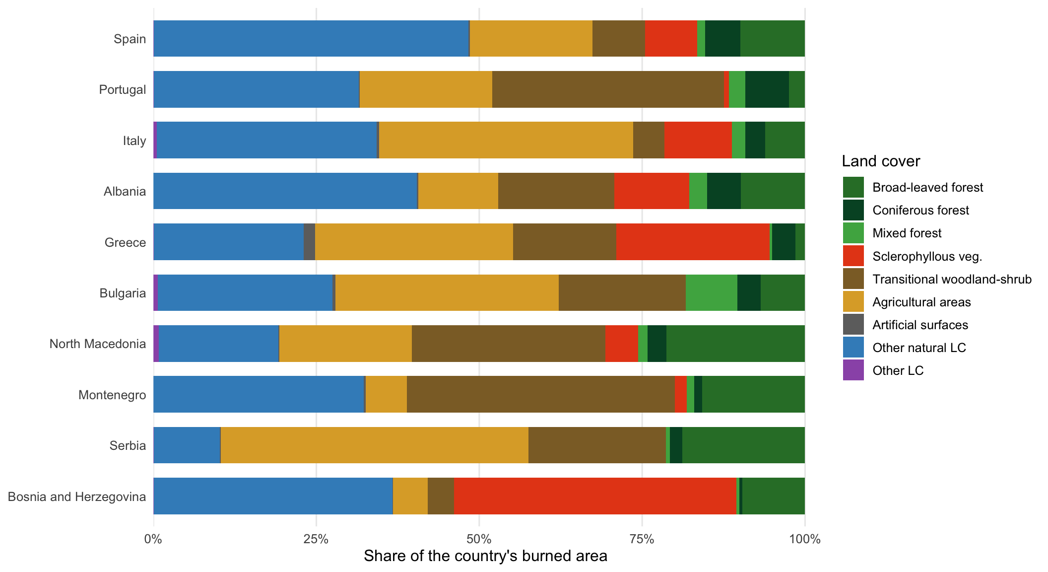
cap_landcover <- sprintf(
  paste(
    "Land-cover composition of burned area in the top-10 countries by total",
    "burned area, 1 June – 30 September 2025. Each bar is one country; segment",
    "widths are that country's burned hectares in each EFFIS land-cover class,",
    "expressed as a share of its 2025 total. Read it as \"what kind of ground",
    "burned here\", not \"how much burned here\". Classes are EFFIS's own",
    "per-perimeter percentages, weighted by each perimeter's Europe-clipped",
    "area. Source: EFFIS rapid perimeters, snapshot %s; geometry in EPSG:3035."
  ),
  snap_lab
)
cap_hero <- sprintf(
  paste(
    "Burn-scar perimeters mapped by EFFIS between 1 June and 30 September 2025,",
    "clipped to Europe and drawn as outlines on national borders. Outlines",
    "rather than fills, because at this scale filled polygons of very different",
    "sizes read as a single smear. Every visible mark is one mapped fire.",
    "Source: EFFIS rapid perimeters, snapshot %s; geometry in EPSG:3035."
  ),
  snap_lab
)
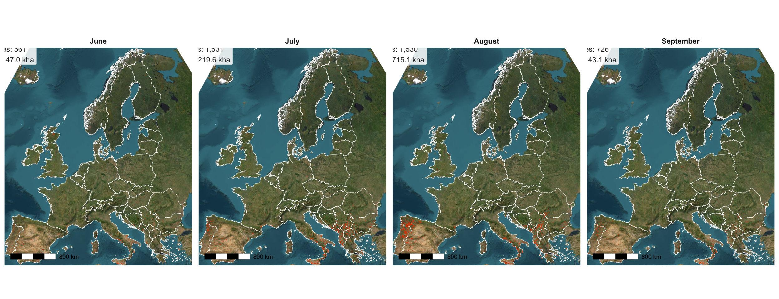
cap_facet <- sprintf(
  paste(
    "The same 2025 perimeters split by month of the season, on Esri World",
    "Imagery. Panel labels report the number of mapped perimeters and the",
    "Europe-clipped burned area for that month. The panels share one map",
    "extent and one scale, so panel-to-panel differences are real differences",
    "in burned area, not differences in zoom. Source: EFFIS rapid perimeters,",
    "snapshot %s; basemap Esri World Imagery."
  ),
  snap_lab
)
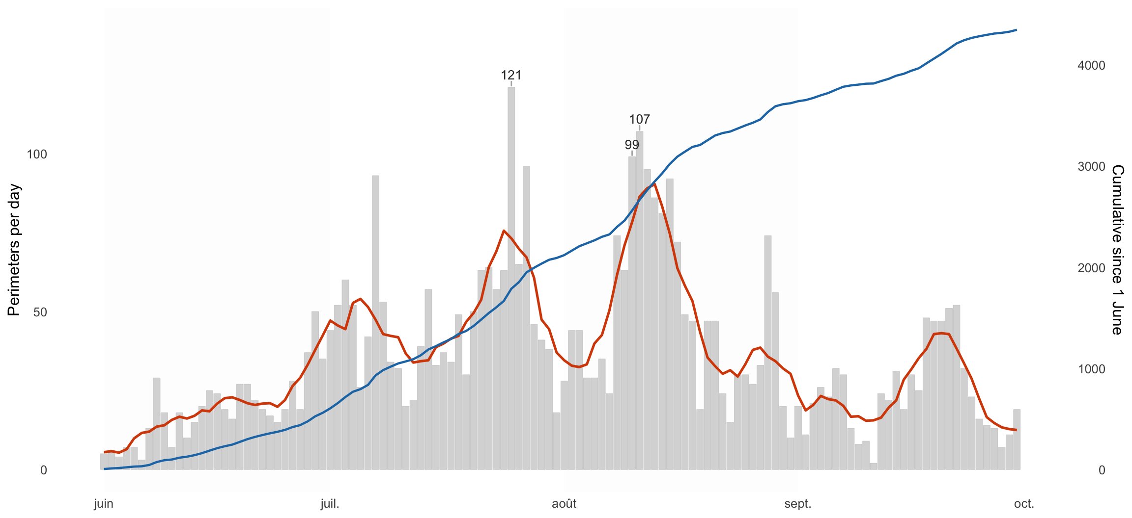
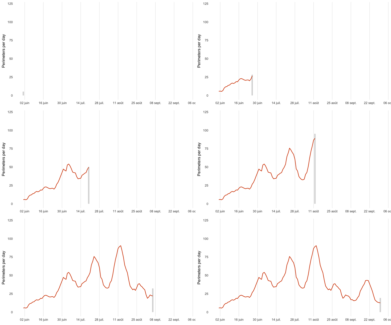
cap_daily <- sprintf(
  paste(
    "Daily count of newly mapped perimeters, 1 June – 30 September 2025. Grey",
    "bars: perimeters first mapped that day. Orange line: 7-day centred mean.",
    "Blue line: cumulative count since 1 June, read on the right axis. The",
    "three busiest days are labelled. This chart counts perimeters, not",
    "hectares, so a day with many small fires can outrank a day with one huge",
    "one. Source: EFFIS rapid perimeters, snapshot %s."
  ),
  snap_lab
)
cap_anim_daily <- sprintf(
  paste(
    "Animated version of the daily-count chart, revealed left to right through",
    "the season. Bars: perimeters mapped per day; line: 7-day centred mean.",
    "Source: EFFIS rapid perimeters, snapshot %s."
  ),
  snap_lab
)
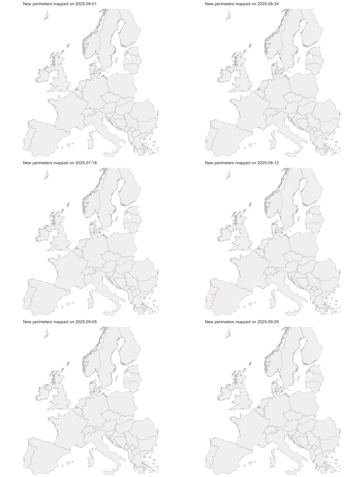
cap_anim_new <- sprintf(
  paste(
    "Day-by-day animation of newly mapped perimeters: each frame shows only the",
    "fires first mapped on that date, so the map goes dark on quiet days.",
    "Geometry simplified to ~2 km for rendering speed, which is why small",
    "perimeters look coarser here than on the static maps. Source: EFFIS rapid",
    "perimeters, snapshot %s."
  ),
  snap_lab
)
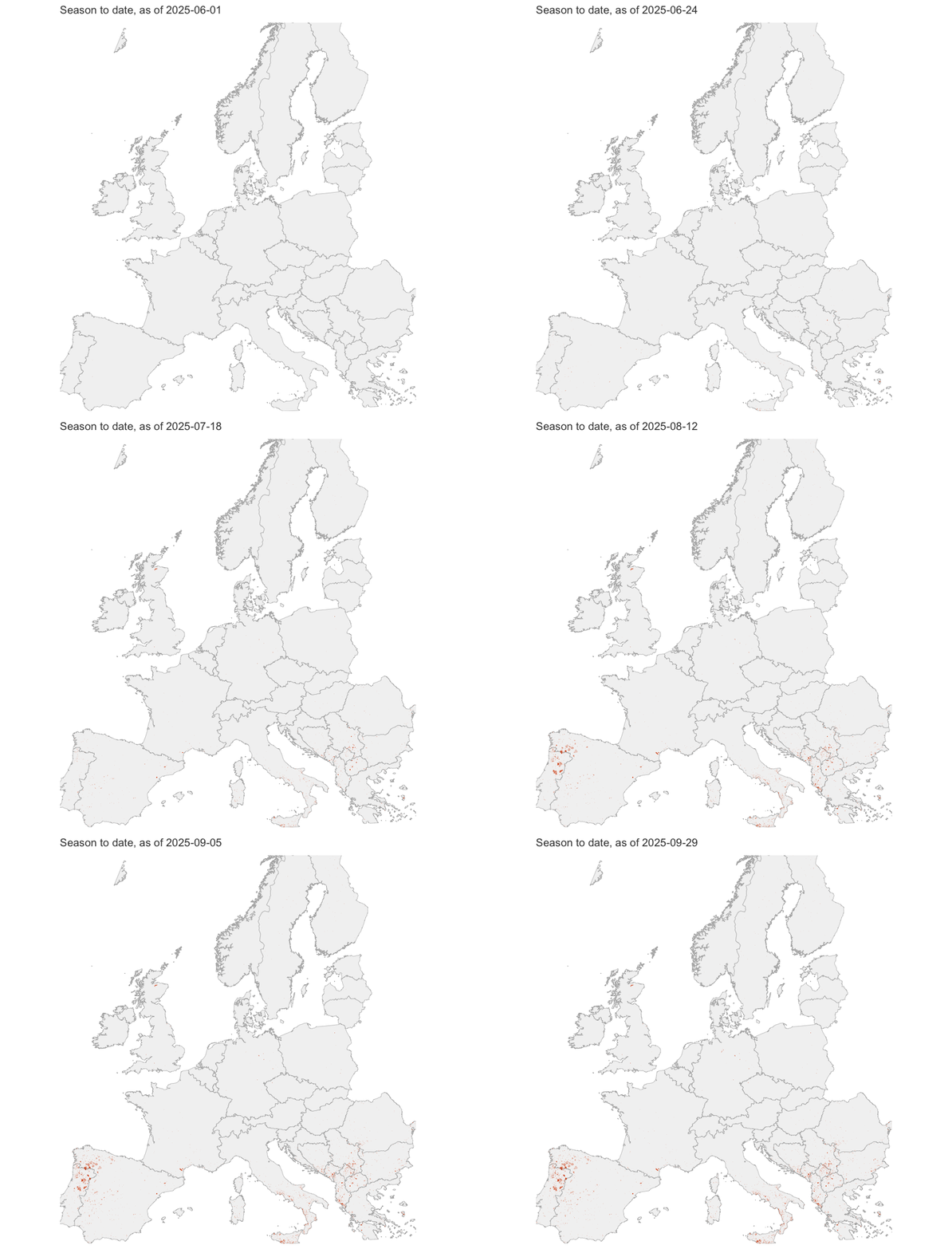
cap_anim_cum <- sprintf(
  paste(
    "The same animation with the season accumulating: each frame adds that",
    "day's perimeters to a faded trail of everything mapped before it, so the",
    "final frame is the whole season. Geometry simplified to ~2 km for",
    "rendering speed. Source: EFFIS rapid perimeters, snapshot %s."
  ),
  snap_lab
)
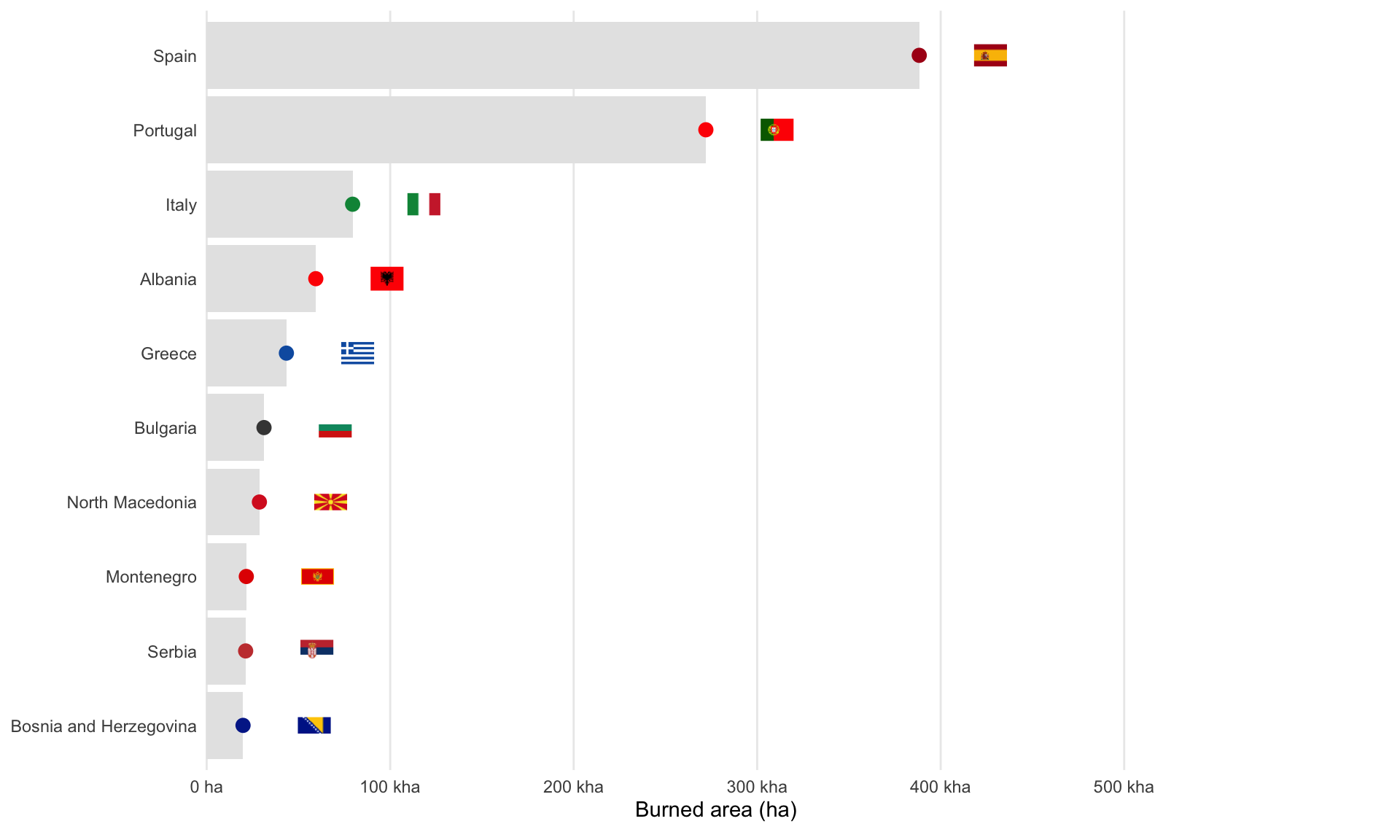
cap_countries <- sprintf(
  paste(
    "Top-10 countries by Europe-clipped burned area, 1 June – 30 September",
    "2025. Bar length is total burned hectares; the coloured dot at each bar's",
    "end and the flag to its right identify the country. Countries are tagged",
    "by maximum overlap of each perimeter with national borders. Source: EFFIS",
    "rapid perimeters, snapshot %s; areas from geometry in EPSG:3035."
  ),
  snap_lab
)
cap_dumbbell <- sprintf(
  paste(
    "Burned area in summer 2025 versus summer 2017, for the 20 countries with",
    "the most burned area in 2025. Each row is one country: the small dot is",
    "its 2017 total, the large dot its 2025 total, and the connecting line the",
    "change between them. A line running left to right means 2025 was worse",
    "than 2017. Both years use the identical 1 June – 30 September window.",
    "Source: EFFIS rapid perimeters, snapshot %s; areas from geometry in",
    "EPSG:3035."
  ),
  snap_lab
)
cap_multiyear <- sprintf(
  paste(
    "Summer burned area across four crisis seasons (2017, 2022, 2023, 2025)",
    "for the ten countries worst hit in 2025, ordered by their 2025 total.",
    "Grouped bars share one axis, so heights are directly comparable across",
    "both years and countries; the 2025 bar is highlighted and its value",
    "labelled. All four years use the identical 1 June – 30 September window.",
    "Source: EFFIS rapid perimeters, snapshot %s; areas from geometry in",
    "EPSG:3035."
  ),
  snap_lab
)
```
Two numbers set the scene. Between **1 June and 30 September 2025**, EFFIS
mapped about **`r comma(round(season_ha, -3))` hectares** of burned land in
Europe, across **`r comma(season_n)`** separate perimeters. That is roughly
`r round(season_ha / 10500)` times the area of the city of Paris. And it was
overwhelmingly an **August** season: that single month accounts for
**`r sprintf("%.0f%%", aug_share)`** of the total.
The size distribution is worth pausing on, because it contradicts what the
first version of this post claimed. **`r sprintf("%.0f%%", pct_under_30)`** of
the mapped perimeters are smaller than 30 hectares, and the median perimeter
is about **`r sprintf("%.0f", median_ha)` hectares**. EFFIS is not a
30-hectare-and-up product any more. What remains true is that the *hectares*
are concentrated in a handful of very large fires, which is what the rest of
this page is really about.
# What has burned: land-cover composition
```{r}
#| label: landcover
#| fig-width: 11
#| fig-height: 6
#| fig-cap: !expr cap_landcover
present_lc <- intersect(lc_cols, names(flat_2025))

lc_shares <- flat_2025 |>
  mutate(across(all_of(present_lc), \(x) to_num(x) / 100)) |>
  mutate(across(all_of(present_lc), \(x) x * area_ha, .names = "{.col}_ha")) |>
  group_by(name_long) |>
  summarise(
    across(c(area_ha, ends_with("_ha")), \(x) sum(x, na.rm = TRUE)),
    .groups = "drop"
  )

top10_lc <- lc_shares |> slice_max(area_ha, n = 10) |> pull(name_long)

comp_long <- lc_shares |>
  filter(name_long %in% top10_lc) |>
  mutate(across(ends_with("_ha") & !matches("^area_ha$"), \(x) x / area_ha)) |>
  select(name_long, area_ha, ends_with("_ha"), -area_ha) |>
  pivot_longer(-name_long, names_to = "class", values_to = "share") |>
  mutate(
    class = lc_labels[sub("_ha$", "", class)],
    class = factor(class, levels = names(pal_lc))
  ) |>
  left_join(lc_shares |> select(name_long, total_ha = area_ha), by = "name_long") |>
  mutate(name_long = fct_reorder(name_long, total_ha))

ggplot(comp_long, aes(x = share, y = name_long, fill = class)) +
  geom_col(width = 0.72, color = NA) +
  scale_fill_manual(values = pal_lc, breaks = names(pal_lc), name = "Land cover") +
  scale_x_continuous(labels = label_percent(), expand = expansion(mult = c(0, 0.02))) +
  labs(x = "Share of the country's burned area", y = NULL) +
  theme_burns(base_size = 12) +
  theme(legend.position = "right")
```
::: {.callout-tip collapse="true" title="What the land-cover classes mean"}
- **Broad-leaved forest**: deciduous trees (oaks, beeches).
- **Coniferous forest**: needle-leaf trees (pines, spruces, firs), including plantations.
- **Mixed forest**: a mixture of broad-leaved and coniferous stands.
- **Sclerophyllous vegetation**: fire-adapted Mediterranean shrubland (maquis, garrigue); evergreen, waxy leaves.
- **Transitional woodland-shrub**: open, regenerating or degraded woodland, shrub mosaics, young stands.
- **Agricultural areas**: arable land, permanent crops, pastures.
- **Artificial surfaces**: urban and built-up areas, infrastructure.
- **Other natural LC**: natural cover not in the above (heath, sparse vegetation, dunes, rock).
- **Other LC**: residual, unknown, or rare classes.
:::
No single land cover dominates. Several types burn together, which is the
point: these are not tidy forest fires but mixed landscapes of scrub, forest,
and abandoned or marginal farmland burning as one.
## Geographic distribution
It is reasonable to expect these events to concentrate in Southern Europe,
with Spain and Portugal especially exposed, and France increasingly so.
```{r}
#| label: hero
#| fig-width: 9
#| fig-height: 8
#| fig-cap: !expr cap_hero
ggplot() +
  geom_sf(data = eu$poly, fill = "grey95", color = "grey70", linewidth = 0.15) +
  geom_sf(data = ba_2025, fill = NA, color = burns_brand$ember,
          linewidth = 0.2, alpha = 0.7) +
  coord_sf() +
  theme_burns(base_size = 11, map = TRUE)
```
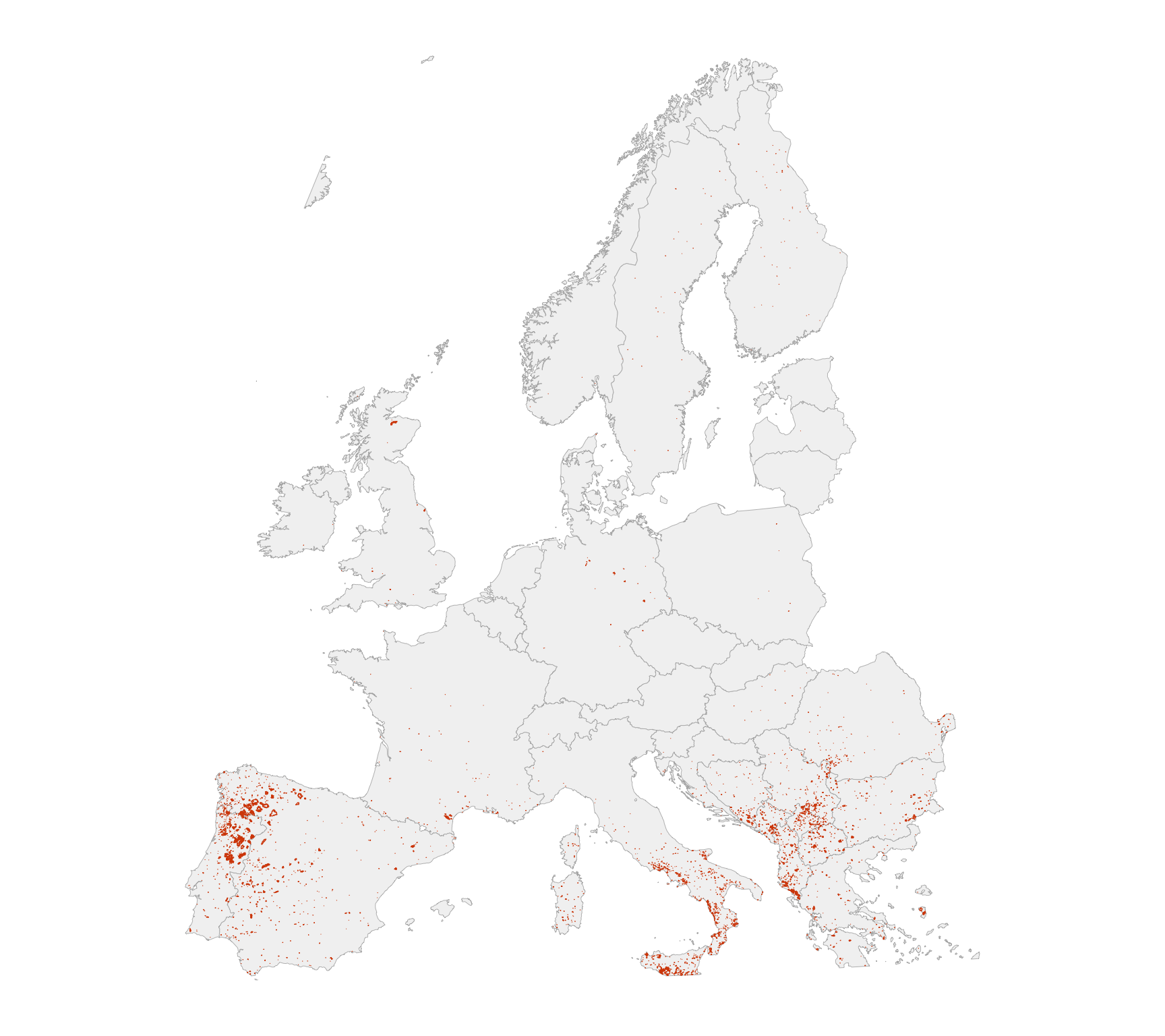
The spatial distribution confirms that wildfires are far from evenly spread
across Europe. They cluster heavily in **Southern and Eastern Europe**, with
striking densities in **Portugal, Spain, southern Italy, and the Balkans**.
These regions are recurrent hotspots, shaped by Mediterranean climatic
stressors, land-use legacies such as agricultural abandonment, and the
structural vulnerability of the wildland–urban interface.
France, particularly the south, also shows notable scars, reinforcing the idea
that wildfire risk is no longer confined to Iberia and the Mediterranean
islands. By contrast, **Central and Northern Europe** show only scattered
events.
> This pattern supports the view that **Southern and Eastern Europe are
> systematically more exposed** to large fires, for climatic and
> socio-environmental reasons alike. At the same time, the spread into France
> and across the Balkans suggests wildfire vulnerability is becoming a
> **pan-European** concern rather than one limited to the Mediterranean fringe.
# When did it burn?
Fire risk might be expected to peak late in summer, once the heat has dragged
on for weeks, water is short, and the landscape is at its driest.
## Month by month
```{r}
#| label: facet-month
#| fig-width: 13
#| fig-height: 5
#| fig-cap: !expr cap_facet
monthly_stats <- flat_2025 |>
  group_by(month) |>
  summarise(n_fires = n(), burned_ha = sum(area_ha, na.rm = TRUE), .groups = "drop") |>
  complete(month = factor(month_levels, levels = month_levels),
           fill = list(n_fires = 0, burned_ha = 0)) |>
  mutate(lab = paste0("Fires: ", comma(n_fires), "\nArea: ", lab_si_ha(burned_ha)))

# Satellite basemap, cached on disk after the first fetch.
bb_ll <- st_bbox(st_transform(eu$poly, 4326))
sat <- maptiles::get_tiles(
  x = st_as_sfc(bb_ll), provider = "Esri.WorldImagery",
  zoom = 4, cachedir = file.path("DATA", "cache")
)
sat_3035 <- terra::project(sat, "EPSG:3035")

bb <- st_bbox(eu$poly)
stats_pos <- monthly_stats |>
  mutate(x = bb["xmin"] + 0.03 * (bb["xmax"] - bb["xmin"]),
         y = bb["ymax"] - 0.03 * (bb["ymax"] - bb["ymin"]))

ggplot() +
  tidyterra::geom_spatraster_rgb(data = sat_3035, maxcell = 3e6, interpolate = TRUE) +
  annotate("rect", xmin = -Inf, xmax = Inf, ymin = -Inf, ymax = Inf,
           fill = alpha("white", 0.06), colour = NA) +
  geom_sf(data = eu$poly, fill = NA, color = "white", linewidth = 0.18, alpha = 0.9) +
  geom_sf(data = ba_2025, fill = burns_brand$ember, alpha = 0.35,
          color = burns_brand$ember, linewidth = 0.06, inherit.aes = FALSE) +
  facet_wrap(~ month, ncol = 4, drop = FALSE) +
  coord_sf(expand = FALSE,
           xlim = c(bb["xmin"], bb["xmax"]), ylim = c(bb["ymin"], bb["ymax"])) +
  geom_label(data = stats_pos, aes(x = x, y = y, label = lab), inherit.aes = FALSE,
             size = 3.1, label.size = 0, label.padding = grid::unit(3, "pt"),
             fill = alpha("white", 0.85), colour = "grey20") +
  ggspatial::annotation_scale(location = "bl", width_hint = 0.25,
                              text_cex = 0.6, line_width = 0.2) +
  theme_burns(base_size = 11, map = TRUE) +
  theme(panel.spacing = grid::unit(8, "pt"),
        strip.text = element_text(face = "bold"),
        legend.position = "none")
```
August is not merely the worst month, it is most of the season:
**`r sprintf("%.0f%%", aug_share)`** of the year's burned area. This supports
the idea that **the longer ecosystems endure sustained summer heat, the more
vulnerable they become**. Late summer is the tipping point: vegetation is
driest, soils are depleted, and firefighting resources are stretched thin
after months of activity.
## Day by day
```{r}
#| label: daily-timeline
#| fig-width: 12
#| fig-height: 5.5
#| fig-cap: !expr cap_daily
season_start <- as.Date(sprintf("%d-%02d-01", YEAR_POST, SEASON_START_MONTH))
season_end   <- as.Date(sprintf("%d-%02d-%02d", YEAR_POST, SEASON_END_MONTH,
                                days_in_month(as.Date(sprintf("%d-%02d-01", YEAR_POST,
                                                              SEASON_END_MONTH)))))

daily <- flat_2025 |>
  count(ba_date, name = "fires") |>
  complete(ba_date = seq(season_start, season_end, by = "day"),
           fill = list(fires = 0)) |>
  arrange(ba_date) |>
  mutate(roll7 = slider::slide_dbl(fires, mean, .before = 3, .after = 3, .complete = FALSE),
         cum_fires = cumsum(fires))

month_bands <- daily |>
  mutate(m = floor_date(ba_date, "month")) |>
  group_by(m) |>
  summarise(xmin = min(ba_date), xmax = max(ba_date) + 1, .groups = "drop") |>
  mutate(even = row_number() %% 2 == 0)

max_daily <- max(daily$fires, na.rm = TRUE)
sfactor   <- max(daily$cum_fires, na.rm = TRUE) / (max_daily * 1.15)
daily     <- daily |> mutate(cum_scaled = cum_fires / sfactor)
peaks     <- daily |> slice_max(fires, n = 3, with_ties = FALSE)

ggplot(daily, aes(x = ba_date)) +
  geom_rect(data = month_bands,
            aes(xmin = xmin, xmax = xmax, ymin = -Inf, ymax = Inf, fill = even),
            inherit.aes = FALSE, alpha = 0.28, show.legend = FALSE) +
  scale_fill_manual(values = c("TRUE" = "white", "FALSE" = "grey98")) +
  geom_col(aes(y = fires), width = 0.9, fill = "grey85",
           color = "grey80", linewidth = 0.15) +
  geom_ribbon(aes(ymin = pmax(0, roll7 - 0.5), ymax = roll7 + 0.5),
              fill = alpha(burns_brand$ember, 0.12), color = NA) +
  geom_line(aes(y = roll7), linewidth = 0.9, color = burns_brand$ember) +
  geom_line(aes(y = cum_scaled), linewidth = 0.8, color = burns_brand$reburn_blue) +
  ggrepel::geom_text_repel(data = peaks, aes(y = fires, label = comma(fires)),
                           nudge_y = 4, size = 3.5, color = "grey20",
                           segment.color = "grey70", seed = 1,
                           box.padding = 0.2, min.segment.length = 0) +
  scale_y_continuous(name = "Perimeters per day",
                     sec.axis = sec_axis(~ . * sfactor,
                                         name = "Cumulative since 1 June")) +
  scale_x_date(date_breaks = "1 month", date_labels = "%b") +
  labs(x = NULL) +
  theme_burns(base_size = 12) +
  theme(panel.grid.major.x = element_blank(),
        axis.text.x = element_text(margin = margin(t = 4)))
```
> Wildfire activity in 2025 did not escalate smoothly. It arrived in waves: a
> first surge in early July, a second in late July, and a third, far more
> intense, in early August. The pattern points to an interaction between
> cumulative vulnerability, as ecosystems dried out under sustained heat, and
> short-term triggers such as heatwaves and wind episodes. Each wave left the
> landscape more fragile, so that by early August conditions were primed for
> the largest outbreaks. Late summer remains the most dangerous period, but the
> timing of the peaks depends heavily on weather extremes layered on a
> background of progressive drying.
## The season in motion
The charts above compress four months into one frame. These animations play
the season back at its own pace, which makes the August cluster much harder to
miss.
```{r}
#| label: anim-daily
#| output: false
p_daily_anim <- ggplot(daily, aes(x = ba_date)) +
  geom_col(aes(y = fires), fill = "grey85", color = "grey80", linewidth = 0.15) +
  geom_line(aes(y = roll7), linewidth = 0.8, color = burns_brand$ember) +
  scale_x_date(date_breaks = "2 weeks", date_labels = "%d %b") +
  labs(x = NULL, y = "Perimeters per day") +
  theme_burns(base_size = 12) +
  transition_reveal(along = ba_date)

# Two non-obvious requirements for every animation on this page:
#
# 1. units = "px" is mandatory. gganimate::animate() forwards width/height to
#    the device, which defaults to INCHES -- omitting units asks for a 900-inch
#    frame (~99,000 px at res = 110), ~95 MB per frame, and never finishes.
#
# 2. The GIF must be written to an explicit path. The project renders with
#    execute-dir: project, so knitr's own figure path for a gganimate GIF
#    resolves against the project root and the file lands in ./2025_files/
#    instead of posts/2025_files/, leaving a broken image in the HTML. Writing
#    to ANIM_DIR and referencing it by a site-absolute path below sidesteps
#    that entirely.
ANIM_DIR <- file.path("assets", "anim")
dir.create(ANIM_DIR, recursive = TRUE, showWarnings = FALSE)

anim_daily <- animate(p_daily_anim, nframes = 100, fps = 12, width = 900, height = 500,
        units = "px", res = 110,
        renderer = gifski_renderer(file.path(ANIM_DIR, "daily-counts.gif")))
```
::: {#fig-anim-daily}
{fig-alt="Animated bar chart of daily wildfire perimeter counts across summer 2025, revealed left to right."}
`r cap_anim_daily`
:::
```{r}
#| label: anim-map-new
#| output: false
# Simplify geometry before animating: the season has thousands of perimeters
# and every frame re-draws them, so full-resolution outlines make the render
# time explode for no visible gain at continental zoom.
# clean_polygons() is required, not cosmetic: a handful of perimeters come back
# from the simplify/intersect chain as GEOMETRYCOLLECTIONs, and transformr
# (which tweens the sf layer between frames) aborts on those with
# "Unsupported geometry type". clean_polygons() keeps only the polygonal part.
ba_anim <- ba_2025 |> select(ba_date, area_ha)
st_geometry(ba_anim) <- clean_polygons(
  st_simplify(st_geometry(ba_anim), dTolerance = 2000, preserveTopology = TRUE)
)
ba_anim <- ba_anim |>
  filter(!st_is_empty(geometry)) |>
  mutate(gid = row_number())

bb_anim <- st_bbox(ba_anim)

p_map_new <- ggplot() +
  geom_sf(data = eu$poly, inherit.aes = FALSE,
          fill = "grey95", color = "grey70", linewidth = 0.2) +
  geom_sf(data = ba_anim, aes(group = gid), fill = burns_brand$ember,
          alpha = 0.55, color = burns_brand$ember, linewidth = 0.05,
          inherit.aes = FALSE) +
  coord_sf(xlim = c(bb_anim["xmin"], bb_anim["xmax"]),
           ylim = c(bb_anim["ymin"], bb_anim["ymax"]), expand = FALSE) +
  labs(subtitle = "New perimeters mapped on {closest_state}") +
  theme_burns(base_size = 12, map = TRUE) +
  transition_states(ba_date, transition_length = 0, state_length = 1, wrap = FALSE) +
  enter_fade() + exit_fade() + ease_aes("linear")

anim_map_new <- animate(p_map_new, nframes = length(unique(ba_anim$ba_date)), fps = 10,
        width = 800, height = 700, units = "px", res = 110,
        renderer = gifski_renderer(file.path(ANIM_DIR, "map-new.gif")))
```
::: {#fig-anim-new}
{fig-alt="Animated map of Europe showing only the wildfire perimeters newly mapped on each day of summer 2025."}
`r cap_anim_new`
:::
```{r}
#| label: anim-map-cumulative
#| output: false
p_map_cum <- ggplot() +
  geom_sf(data = eu$poly, inherit.aes = FALSE,
          fill = "grey95", color = "grey70", linewidth = 0.2) +
  geom_sf(data = ba_anim, aes(group = gid), fill = burns_brand$ember,
          alpha = 0.55, color = burns_brand$ember, linewidth = 0.05,
          inherit.aes = FALSE) +
  coord_sf(xlim = c(bb_anim["xmin"], bb_anim["xmax"]),
           ylim = c(bb_anim["ymin"], bb_anim["ymax"]), expand = FALSE) +
  labs(subtitle = "Season to date, as of {closest_state}") +
  theme_burns(base_size = 12, map = TRUE) +
  transition_states(ba_date, transition_length = 0, state_length = 1, wrap = FALSE) +
  shadow_mark(past = TRUE, future = FALSE, alpha = 0.15, size = 0.02) +
  enter_fade() + exit_fade() + ease_aes("linear")

anim_map_cum <- animate(p_map_cum, nframes = length(unique(ba_anim$ba_date)), fps = 10,
        width = 800, height = 700, units = "px", res = 110,
        renderer = gifski_renderer(file.path(ANIM_DIR, "map-cumulative.gif")))
```
::: {#fig-anim-cumulative}
{fig-alt="Animated map of Europe accumulating wildfire perimeters day by day through summer 2025, ending with the full season."}
`r cap_anim_cum`
:::
# How 2025 compares with earlier seasons
To put 2025 in perspective, start with which countries were worst hit, then
place the season against **2017**, long treated as the benchmark for a
catastrophic European fire year, and finally against **2022 and 2023**, the
other recent crisis seasons. Together they show whether 2025 was an anomaly or
part of a pattern.
## Worst-hit countries in 2025
```{r}
#| label: top-countries
#| fig-width: 10
#| fig-height: 6
#| fig-cap: !expr cap_countries
ctry_2025 <- flat_2025 |>
  group_by(name_long) |>
  summarise(burned_ha = sum(area_ha, na.rm = TRUE), n_fires = n(), .groups = "drop") |>
  slice_max(burned_ha, n = 10) |>
  mutate(name_long = fct_reorder(name_long, burned_ha))

flags_10 <- flag_table(as.character(ctry_2025$name_long), eu$poly)

bars_df <- ctry_2025 |>
  mutate(name_long_chr = as.character(name_long)) |>
  left_join(flags_10, by = c("name_long_chr" = "name_long")) |>
  mutate(col = coalesce(col, "#444444"),
         x_flag = burned_ha + 0.10 * max(burned_ha, na.rm = TRUE))

ggplot(bars_df, aes(x = burned_ha, y = name_long)) +
  geom_col(fill = "grey90") +
  geom_point(aes(color = col), size = 3) +
  scale_color_identity() +
  ggimage::geom_image(data = filter(bars_df, !is.na(flag_path)),
                      aes(x = x_flag, y = name_long, image = flag_path),
                      inherit.aes = FALSE, size = 0.065, asp = 2/3) +
  scale_x_continuous(labels = lab_si_ha, expand = expansion(mult = c(0, 0.30))) +
  labs(x = "Burned area (ha)", y = NULL) +
  theme_burns(base_size = 11) +
  theme(plot.margin = margin(5.5, 90, 10, 5.5, "pt")) +
  coord_cartesian(clip = "off")
```
```{r}
#| label: france-rank
#| echo: false
fr_rank <- flat_2025 |>
group_by(name_long) |>
summarise(ha = sum(area_ha, na.rm = TRUE), .groups = "drop") |>
arrange(desc(ha)) |>
mutate(rank = row_number()) |>
filter(name_long == "France")
```
Spain and Portugal, as expected, and by a wide margin: between them they
account for most of the European total. France comes
**`r fr_rank$rank`th**, with about `r comma(round(fr_rank$ha, -2))` hectares.
The fires that made the French news were real and locally severe, but on a
continental scale 2025 was an Iberian season.
## 2025 against the 2017 benchmark
```{r}
#| label: dumbbell-2017
#| fig-width: 11
#| fig-height: 8
#| fig-cap: !expr cap_dumbbell
ctry_multi <- map_dfr(COMPARE_YEARS, function(y) {
  get_tagged_summer(y, snap, eu, SEASON_START_MONTH, SEASON_END_MONTH) |>
    st_drop_geometry() |>
    group_by(name_long) |>
    summarise(burned_ha = sum(area_ha, na.rm = TRUE), .groups = "drop") |>
    mutate(year = y)
})

dd <- ctry_multi |>
  filter(year %in% c(2017L, YEAR_POST)) |>
  pivot_wider(names_from = year, values_from = burned_ha, values_fill = 0) |>
  slice_max(`2025`, n = 20) |>
  mutate(name_long = fct_reorder(name_long, `2025`))

flags_20 <- flag_table(as.character(dd$name_long), eu$poly)
dd_plot <- dd |>
  mutate(name_long_chr = as.character(name_long)) |>
  left_join(flags_20, by = c("name_long_chr" = "name_long")) |>
  mutate(col = coalesce(col, "#444444"))

max_x  <- max(c(dd_plot$`2017`, dd_plot$`2025`), na.rm = TRUE)
x_left <- -0.25 * max_x
x_name <- -0.05 * max_x

ggplot(dd_plot) +
  geom_segment(aes(x = `2017`, xend = `2025`, y = name_long, yend = name_long,
                   colour = col),
               linewidth = 0.9, alpha = 0.9, lineend = "round", show.legend = FALSE) +
  geom_point(aes(x = `2017`, y = name_long, colour = col), size = 2.4, show.legend = FALSE) +
  geom_point(aes(x = `2025`, y = name_long, colour = col), size = 3.1, show.legend = FALSE) +
  ggimage::geom_image(aes(y = name_long, x = x_left, image = flag_path),
                      size = 0.1, asp = 2/3, inherit.aes = FALSE, na.rm = TRUE) +
  geom_text(aes(y = name_long, x = x_name, label = name_long),
            size = 3.7, hjust = 1, inherit.aes = FALSE) +
  scale_colour_identity() +
  scale_x_continuous(labels = lab_si_ha, expand = expansion(mult = c(0, 0.03))) +
  labs(x = "Burned area (ha)", y = NULL) +
  theme_burns(base_size = 12) +
  theme(axis.text.y = element_blank(), axis.ticks.y = element_blank(),
        plot.margin = margin(5.5, 5.5, 10, 110, "pt")) +
  coord_cartesian(xlim = c(-0.18 * max_x, NA), clip = "off")
```
```{r}
#| label: compare-facts
#| echo: false
cmp <- ctry_multi |>
pivot_wider(names_from = year, values_from = burned_ha, values_fill = 0)
get_ha <- function(country, yr) {
v <- cmp[[as.character(yr)]][cmp$name_long == country]
if (length(v) == 0) 0 else v
}
```
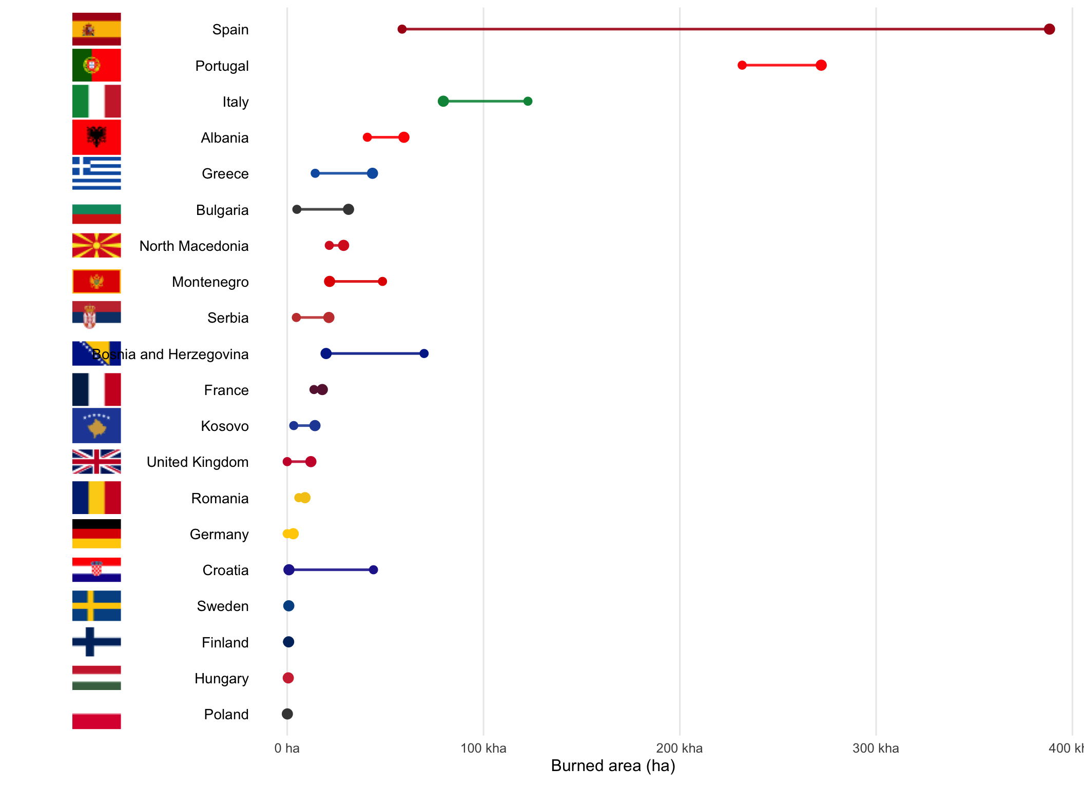
This is where the rebuilt data departs most sharply from the original version
of this post. On the current perimeters, **Spain** is the dominant case:
about `r comma(round(get_ha("Spain", 2025), -2))` hectares in 2025 against
roughly `r comma(round(get_ha("Spain", 2017), -2))` in 2017, a sixfold
increase. The first version of this post described Spain as having "already
suffered catastrophic losses in 2017"; on the revised EFFIS record its 2017
summer was comparatively moderate, and 2025 is the outlier.
**Portugal** is the other correction. The original text had Portugal recording
much smaller losses in 2025 than in its emblematic 2017 crisis. The current
data shows the opposite: about
`r comma(round(get_ha("Portugal", 2025), -2))` hectares in 2025 against
`r comma(round(get_ha("Portugal", 2017), -2))` in 2017. Portugal did not
escape 2025; it had a worse summer than the one that reshaped its fire policy.
**Italy** still burned more in 2017 than in 2025
(`r comma(round(get_ha("Italy", 2017), -2))` against
`r comma(round(get_ha("Italy", 2025), -2))` hectares), and several Balkan
countries appear in both years, confirming the region's structural exposure.
France, not a major outlier in 2017, sits higher in 2025.
Overall, the **Mediterranean South remains the epicentre**, but the relative
weight of countries within it shifts markedly from year to year. That
instability, more than any single ranking, is the durable finding.
## 2025 against 2017, 2022, and 2023
```{r}
#| label: multiyear-bars
#| fig-width: 12
#| fig-height: 7
#| fig-cap: !expr cap_multiyear
top10_multi <- ctry_multi |>
  filter(year == YEAR_POST) |>
  slice_max(burned_ha, n = 10) |>
  pull(name_long)

order_2025 <- ctry_multi |>
  filter(year == YEAR_POST, name_long %in% top10_multi) |>
  arrange(desc(burned_ha)) |>
  pull(name_long)

df_plot <- ctry_multi |>
  filter(name_long %in% top10_multi) |>
  mutate(name_long = fct_relevel(name_long, rev(order_2025)),
         year = factor(year))

max_x <- max(df_plot$burned_ha, na.rm = TRUE)
layout_df <- df_plot |>
  group_by(name_long) |>
  summarise(x_max = max(burned_ha, na.rm = TRUE), .groups = "drop") |>
  left_join(df_plot |> filter(year == as.character(YEAR_POST)) |>
              select(name_long, val_cur = burned_ha), by = "name_long") |>
  mutate(name_long_chr = as.character(name_long)) |>
  left_join(flag_table(as.character(unique(df_plot$name_long)), eu$poly),
            by = c("name_long_chr" = "name_long")) |>
  mutate(x_label   = x_max + 0.10 * max_x,
         x_flag    = x_label + 0.06 * max_x,
         x_country = x_flag  + 0.03 * max_x,
         label_txt = lab_si_ha(val_cur))

col_map <- c(`2017` = "grey80", `2022` = "grey65", `2023` = "grey55",
             `2025` = burns_brand$ember)

ggplot(df_plot, aes(y = name_long, x = burned_ha, fill = year)) +
  geom_col(position = position_dodge(width = 0.7), width = 0.65) +
  scale_fill_manual(values = col_map, name = "Year") +
  scale_x_continuous(labels = lab_si_ha, expand = expansion(mult = c(0, 0.55))) +
  geom_text(data = layout_df, aes(y = name_long, x = x_label, label = label_txt),
            inherit.aes = FALSE, hjust = 1, vjust = 0.5, size = 3.7,
            colour = col_map[["2025"]]) +
  ggimage::geom_image(data = filter(layout_df, !is.na(flag_path)),
                      aes(y = name_long, x = x_flag, image = flag_path),
                      inherit.aes = FALSE, size = 0.07, asp = 2/3) +
  geom_text(data = layout_df, aes(y = name_long, x = x_country, label = name_long),
            inherit.aes = FALSE, hjust = 0, vjust = 0.5, size = 4) +
  labs(x = "Burned area (ha)", y = NULL) +
  theme_burns(base_size = 13) +
  theme(legend.position = "right",
        axis.text.y = element_blank(), axis.ticks.y = element_blank(),
        plot.margin = margin(5.5, 140, 14, 5.5, "pt")) +
  coord_cartesian(clip = "off")
```
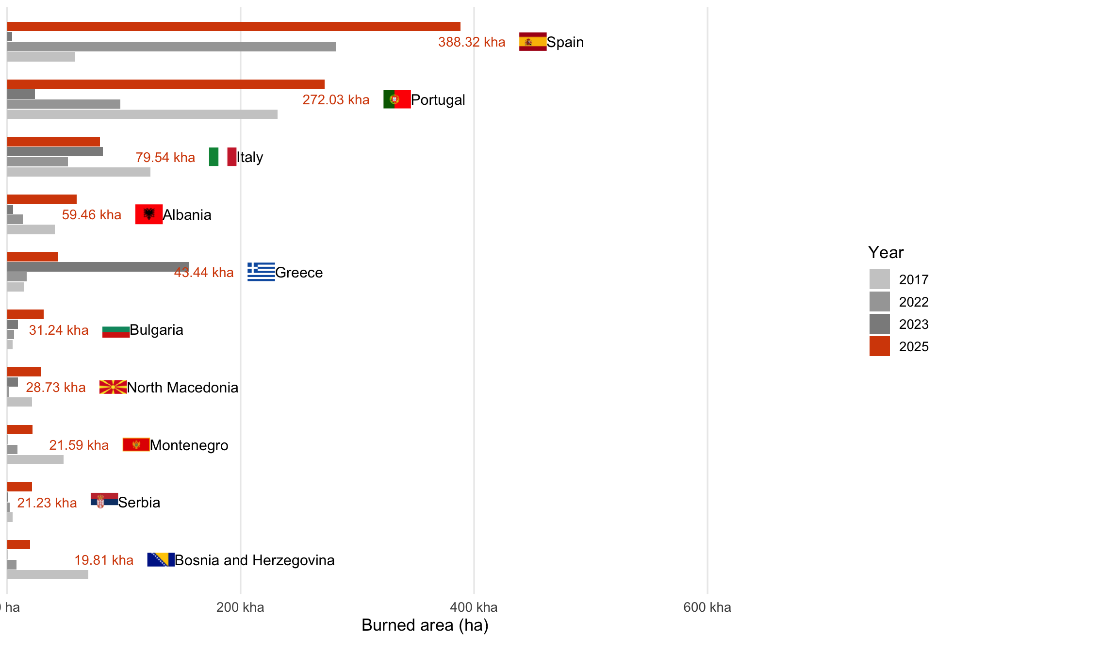
> This situates 2025 within a broader multi-year picture, against the other
> recent crisis years.
Spain dominates: its 2025 burned area clearly surpasses its own earlier peaks
and every other national total in the comparison. Portugal, the emblematic
case of 2017, records its highest figure of the four years in 2025. Greece
stands out differently: its worst year here is **2023**, driven overwhelmingly
by the Dadia fire in Évros, which alone burned close to 96,000 hectares and
remains the largest single perimeter in the European record.
What is striking is not only the magnitude of 2025 for Iberia, but the
**geographic rotation of high-impact years**. Different countries surface at
different times: Portugal in 2017, Greece in 2023, Spain and Portugal together
in 2025. Extreme fire seasons are not confined to one geography; they move
within the Mediterranean and Balkan regions depending on where the heat, wind,
and drought line up.
By setting 2025 alongside 2017, 2022, and 2023, the comparison suggests 2025
was not an isolated anomaly but part of a recurring pattern of **severe
pan-European fire years**, each with its own epicentre.
## Notes and caveats
The figures and maps here are based on **EFFIS rapid perimeter data**, which
relies on satellite detection and automated mapping. This gives timely,
consistent, continent-wide coverage, but it differs from official national
fire statistics, which use different thresholds, definitions of burned area,
and reporting criteria. Treat the numbers as **estimates**, not exact totals.
A note on revision: EFFIS corrects its rapid mapping as better imagery
arrives, so these figures are a snapshot (`r snap_lab`) rather than a final
accounting. This is also why the numbers here differ from the version of this
post published in September 2025.
On temporal framing, this analysis defines the season as **1 June to 30
September**. The original version used June to August. The wider window
improves comparability with the rest of this site and captures early-autumn
outbreaks, which matter in some regions, but fire agencies use their own
seasonal boundaries and totals will differ accordingly.
Country attribution uses **maximum spatial overlap** with national borders,
which can under- or over-attribute in border areas. Areas are computed
directly from perimeter geometry in an equal-area projection (EPSG:3035).
Finally, these results are for **analytical and exploratory purposes**. They
offer a comparative overview of European wildfire dynamics but are not
official statistics. For policy, management, or operational decisions, consult
authoritative national and European reporting.